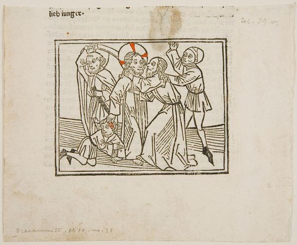
c. 15th century
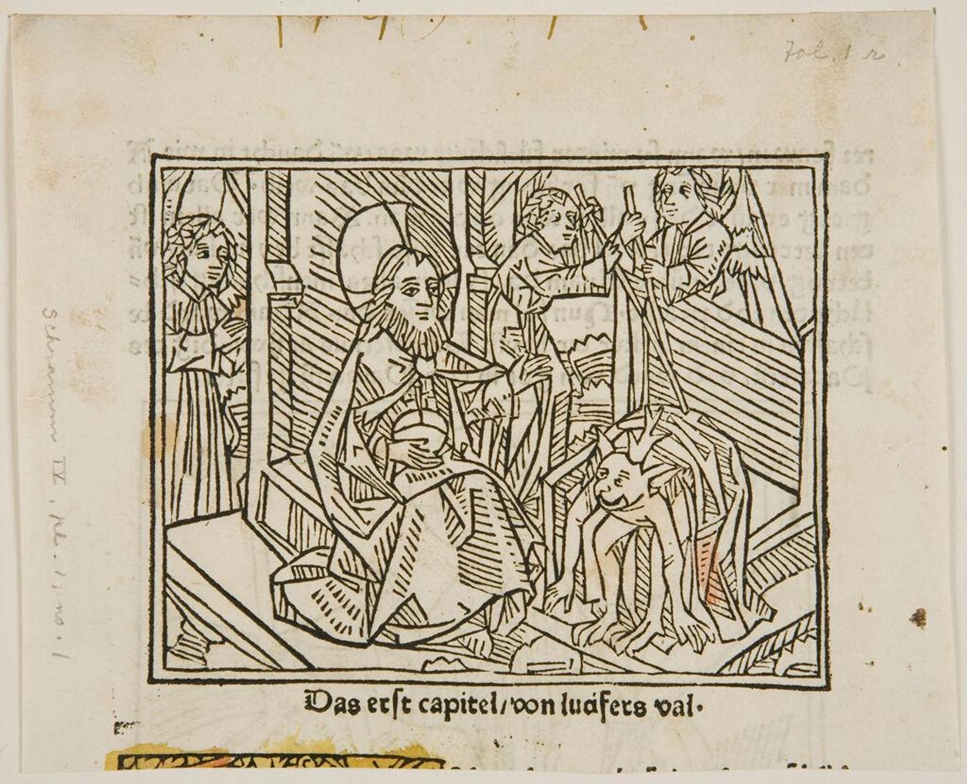
The Fall of Lucifer; verso: The Creation of Eve from Adam's Side
Listen to curator's interpretation
Curatorial notes
Editor: This is "The Fall of Lucifer" by an anonymous artist. It appears to be a woodcut print. The linear composition is quite striking, creating a sense of depth despite the flat picture plane. What do you make of the artist's use of line and form here? Curator: Indeed, the stark contrast between the thick, bold lines and the white space is crucial. Consider how the lines define form, but also flatten it, creating a tension between representation and abstraction. The composition is organized by a series of diagonals; what effect do you think that might have on the viewer? Editor: It creates a sense of dynamism, almost of collapse, reflecting the fall itself. I hadn't considered how much the structure contributes to the narrative. Curator: Precisely. The structure isn't merely decorative; it's integral to the meaning. Observing the structural elements helps us to understand the artist's intent. Editor: I’m beginning to see how the visual language of art can speak volumes.