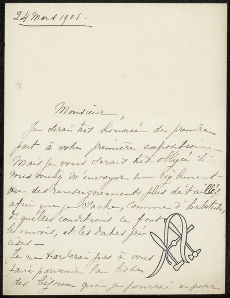
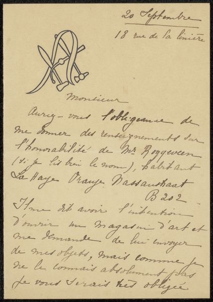
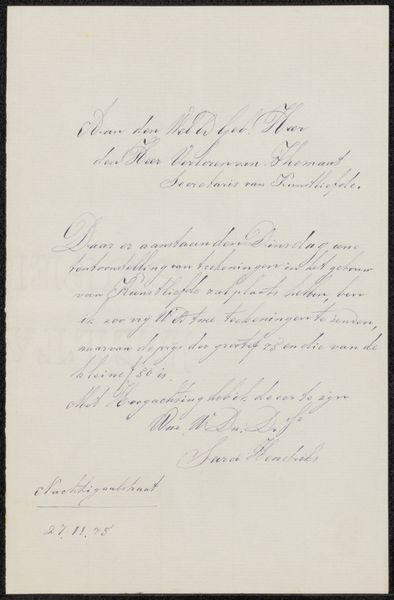
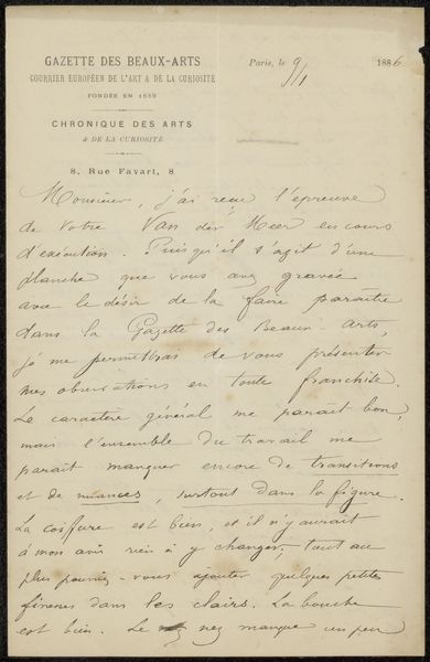
drawing, ink, pen
#
drawing
#
pen drawing
#
pen sketch
#
ink
#
pen-ink sketch
#
pen
#
calligraphy
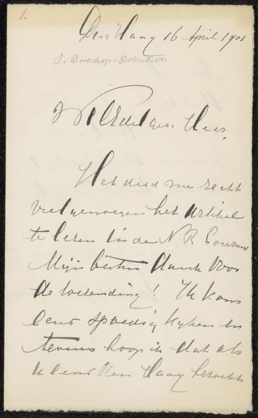
Copyright: Rijks Museum: Open Domain
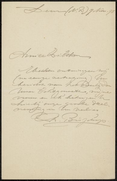
Editor: This pen and ink drawing is entitled "Brief aan Philip Zilcken," possibly created between 1901 and 1908 by Alice Holbach. The elegant script and monogram are striking. What do you see in this piece? Curator: Formally, the drawing presents an intriguing interplay between text and image. Observe the lines: the calligraphic script exhibits a controlled, rhythmic flow, while the monogram disrupts this flow with its bold geometric structure. Editor: I see what you mean, the contrast is quite stark! It almost feels like two different artists worked on it. Curator: Precisely! The contrast highlights the materiality of the piece. Note the careful consideration given to line weight and the density of ink in different areas. Ask yourself, how does this variation affect the visual hierarchy and the overall balance? Editor: It seems like the monogram is trying to grab my attention first, then guide me through the text like some form of personal brandmark of the time. Curator: An astute observation. And what of the negative space? Consider its role in defining shapes and creating visual breathing room. Is there an implied tension created by its distribution, in relation to where the letter has been creased at some point? Editor: Now that you mention it, I see how the blank space almost emphasizes the formality of the text... giving the content weight. Curator: Indeed. So, by isolating and analyzing these formal elements – line, shape, texture, space – we can start to decode the visual structure and appreciate how Holbach orchestrates these elements to create a sophisticated whole. I see it as carefully balanced tension, and consider the formal impact of the holes punched at the top. What have you learnt from looking closer at it this way? Editor: That was incredibly enlightening. It's easy to miss these details without formal analysis. Thank you!
Comments
No comments
Be the first to comment and join the conversation on the ultimate creative platform.
More like this