drawing, paper, photography, ink
#
drawing
#
hand written
#
paper
#
photography
#
ink
#
hand-written
Copyright: Rijks Museum: Open Domain
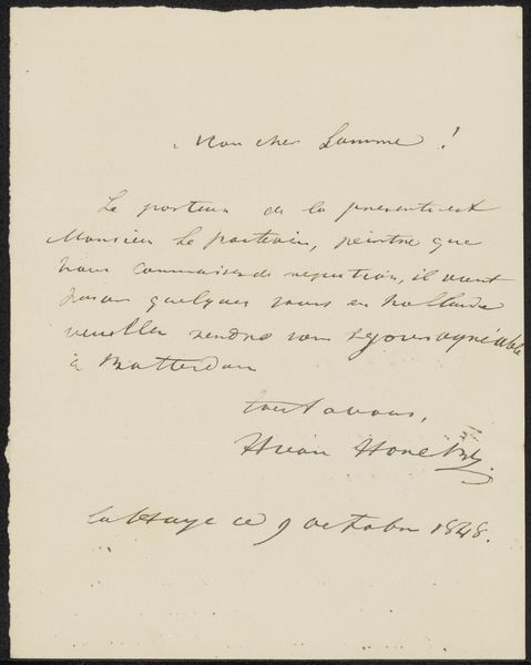
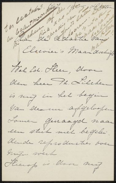
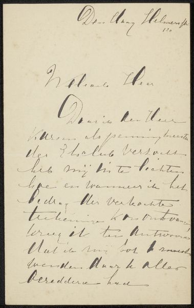
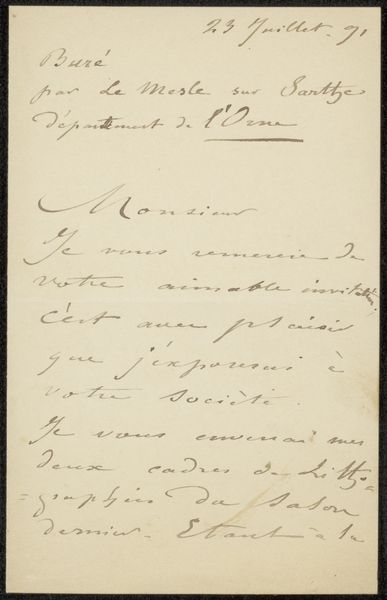
Curator: This fragile, sepia-toned image captures a handwritten letter entitled "Brief aan Philip Zilcken." Although the precise date is debated, experts believe it may originate somewhere between 1903 and 1929, rendered in ink on paper. Editor: It has an immediate feeling of intimacy and careful deliberation. The lines of script, in varying tones of fading black, look dense, but there’s a remarkable elegance in their execution. The way the ink pools slightly around the curves gives them this gentle presence. Curator: Precisely. The calligraphic structure is worth noting: observe the carefully formed ascenders and descenders of the letters. Note too, how the text aligns to the top-left corner, with an emphasis on the date as well as the greeting, setting the structural tone for the information to come. Editor: I’m intrigued by the French salutation "Cher Philippe" — suggesting a relationship between the writer and recipient and the subsequent holiday greetings, offering good wishes for the new year and evoking pleasant memories. It's imbued with symbolism. Perhaps a nostalgic yearning, as if revisiting memories embedded within Janastract and Princess Marie! What feelings do these locations trigger? What meanings might they have for the two letter writers? Curator: Consider the weight of handwritten correspondence at that time. The texture of the paper, the deliberate formation of each letter—each of these serves a semantic role, underscoring the message. Also the way the writing almost overwhelms the surface. A compositional density adds meaning here: a world that would eventually find expression via modernism, with a strong European aesthetic. Editor: Agreed, a kind of delicate, pre-war sensibility. It's more than just a piece of correspondence. It seems to be the writer preserving the intimate emotional record from a specific point in the subject's life. This simple exchange encapsulates so much about humanity's relationships: affection, memory, and time’s inevitable passage. Curator: For me, examining the graphic interplay between text and substrate encourages us to look past a sentimental reading. In the delicate strokes, we glimpse an artifact of beauty, rendered with skill. Editor: It's precisely that balance between emotion and skillful crafting that gives "Brief aan Philip Zilcken" such a resonating appeal. A seemingly mundane piece made profound.
Comments
No comments
Be the first to comment and join the conversation on the ultimate creative platform.
More like this