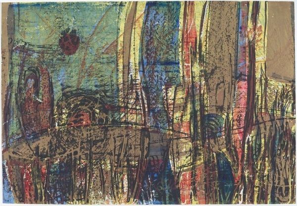
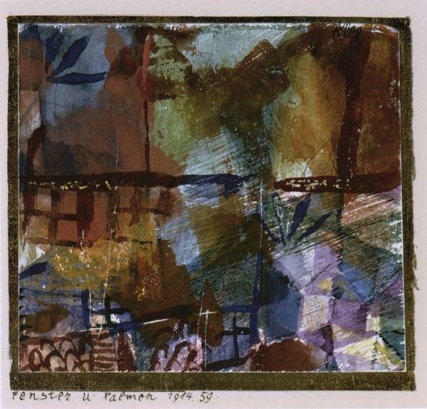
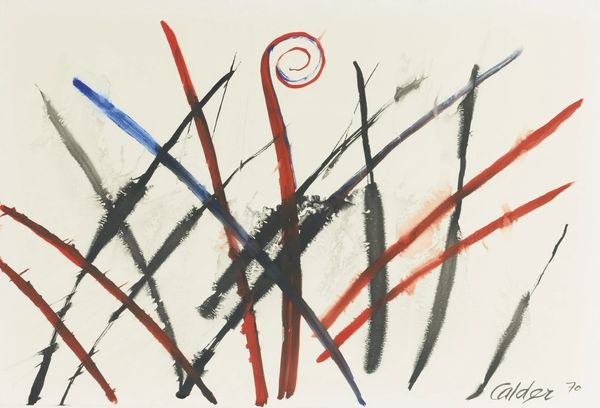
watercolor
#
watercolor
#
coloured pencil
#
expressionism
#
abstraction
#
line
Copyright: Public Domain: Artvee
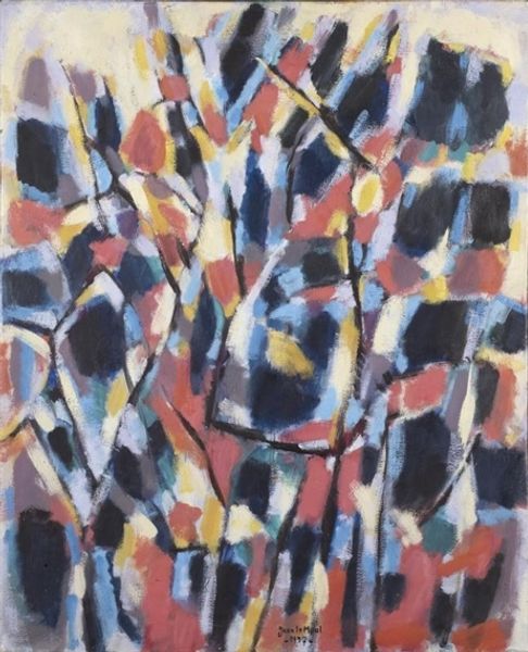
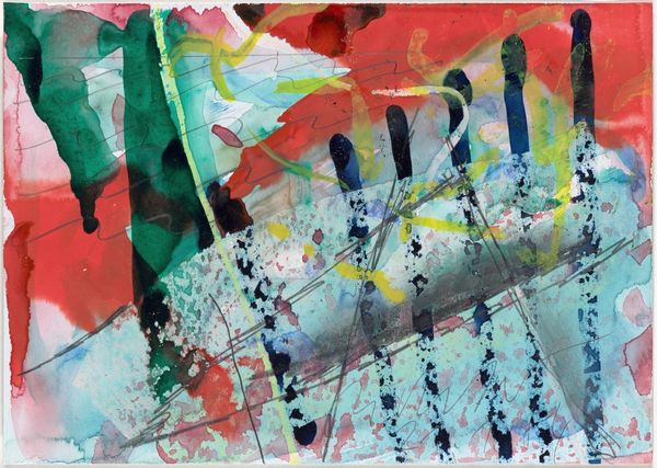
Editor: This is Paul Klee’s "Laternen," created in 1912 using watercolor and what looks like coloured pencil. I am intrigued by the interplay of the dark washes and the thin, linear elements... It almost feels like a blueprint. What strikes you when you look at this, from your perspective? Curator: What fascinates me is Klee's process. Look at how he marries what were then considered 'high art' and 'low art' materials, watercolor traditionally associated with landscapes, and the coloured pencil we may have found in the drafting room. Do you notice how the watercolour bleeds into the fibers of the paper itself? Editor: Yes, the textures definitely add another layer! Curator: Precisely! Consider too, that this piece was created in 1912 - amidst massive industrial development and shifting class dynamics in Europe. Could the "blueprint" quality you noticed perhaps be a commentary on these changes? Is Klee speaking to anxieties and hopes bound up with materiality and industrial manufacture of that era? Editor: I never thought of it that way. It's interesting how the materials themselves might reflect larger social and economic changes. So, it's not just about the "what" is depicted, but *how* it's depicted and *what with* that reveals the underlying message. Curator: Exactly! The artistic process and choice of material provide an entry point into thinking about Klee's own positioning in relation to this changing world. It asks us to examine his labor in the work. And how does our own consumption, or viewing, complete that cycle? Editor: I see! Thanks, this gave me so much to consider.
Comments
No comments
Be the first to comment and join the conversation on the ultimate creative platform.
More like this