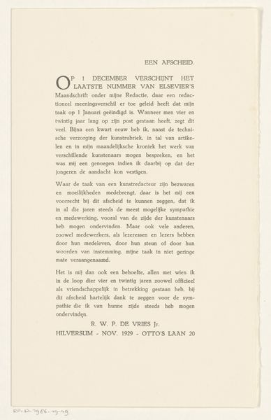
1932
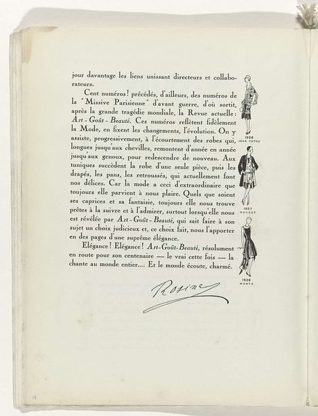
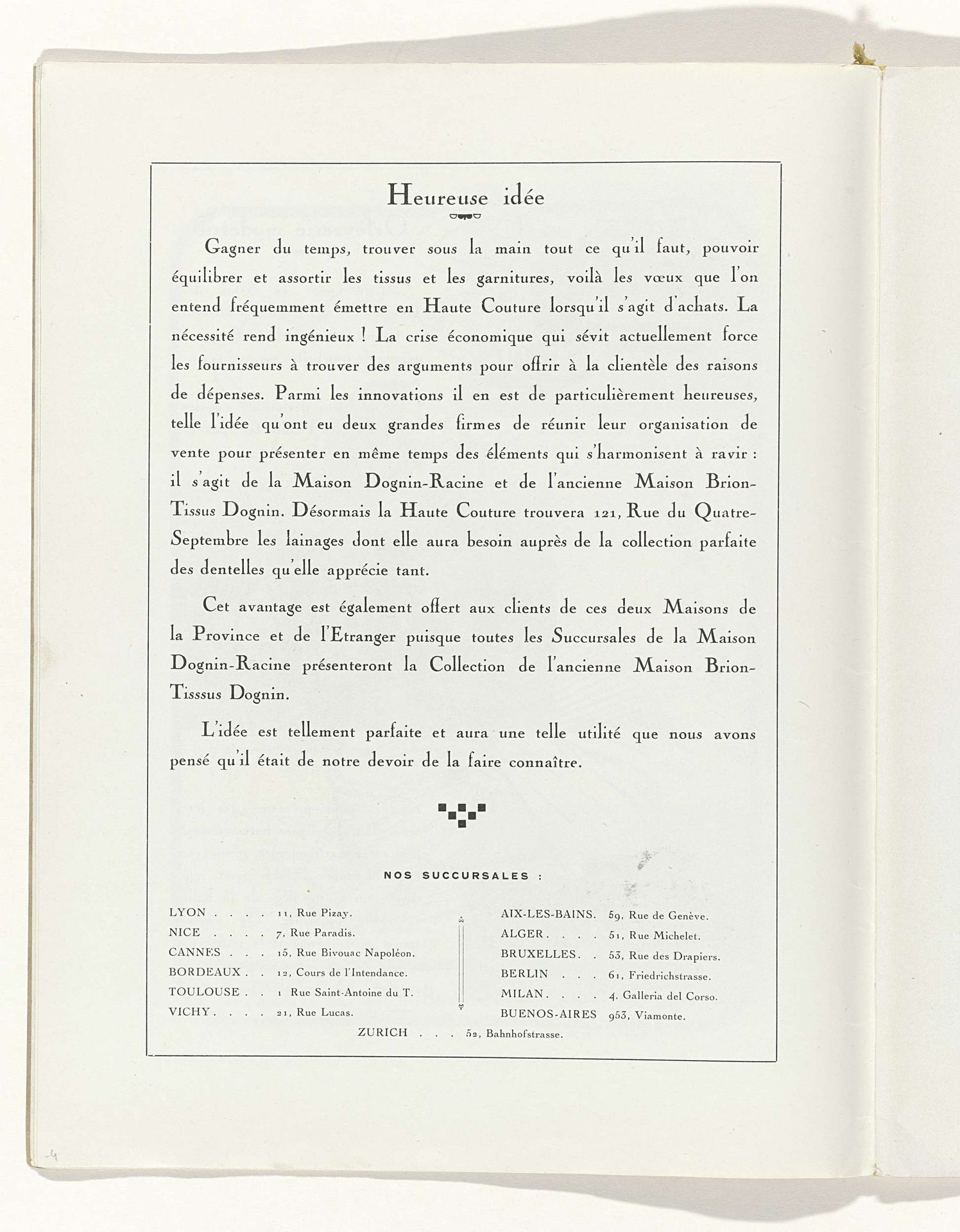
Art - Goût - Beauté, Feuillets de l' élégance féminine, Juin 1932, No. 142, 12e Année, p. 4
Listen to curator's interpretation
Curatorial notes
Curator: This print comes from a 1932 issue of "Feuillets de l'Élégance Féminine," a French publication focused on feminine elegance and taste. The page is attributed to H. Rouit. Editor: Hmm, my first thought? Clean. It has such a balanced simplicity, almost minimalist for the period. The layout guides my eye directly to the text. Very calming, actually, even though it’s a page full of words. Curator: Absolutely. Its aesthetic is rooted in the Art Deco movement, with its clean lines and focus on streamlined elegance. Note the emphasis on typography as a design element in itself, a technique deeply interwoven with the cultural shifts of the time. We are in between world wars and witness an acceleration in industrial design that influenced even how words were displayed. Editor: I get that feeling of history, the way it breathes off the page. There’s a delicate contrast between the precision of the typography and what seems like the paper’s natural aging. You can almost feel the slight imperfections. Curator: It’s interesting that you pick up on the apparent ‘imperfections,’ given this page is fundamentally about perfection of ‘goût,’ which translates as taste, or rather, judgment of quality, but also implies a sense of social status and access to high fashion. This particular issue features an announcement for Maison Dognin-Racine, a collaboration meant to streamline the procurement process for elite customers. The focus seems to be saving clients time. Editor: I never thought of the status element to "saving time." It does feel very of-the-moment. It speaks to how efficiency, even in leisurely pursuits like fashion, became increasingly valued. There is such confidence and decisiveness in how everything is placed; you know exactly where the headquarters and subsidiaries are placed across Europe, for example. Curator: This print provides insight into the changing dynamics of the fashion industry, but also sheds light on the growing consumerism and the ways businesses were adapting to meet the demands of a rapidly evolving society. This print becomes less about high fashion in isolation and more about industrial acceleration. Editor: Exactly. Looking at this page now, I think it offers something new each time you return to it; at first it is beautiful in a familiar way, but later it offers some historical insights. The simplicity serves as a reminder to consider the hidden complexity of what is in plain sight.