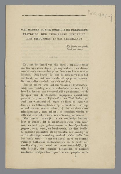
Afscheidsbrief van R.W.P. de Vries Jr. als redacteur van Elsevier's Maandschrift 1929
0:00
0:00
graphic-art, print, textile, paper, typography
#
graphic-art
#
image layout
#
dutch-golden-age
# print
#
textile
#
paper
#
typography
#
image and text
#
photo layout
#
captioned image
Dimensions: height 233 mm, width 144 mm, width 288 mm
Copyright: Rijks Museum: Open Domain
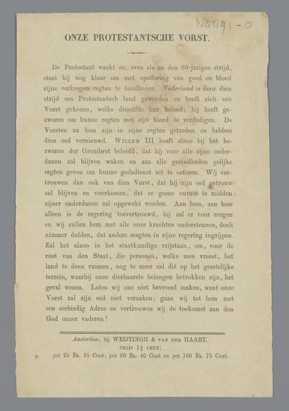
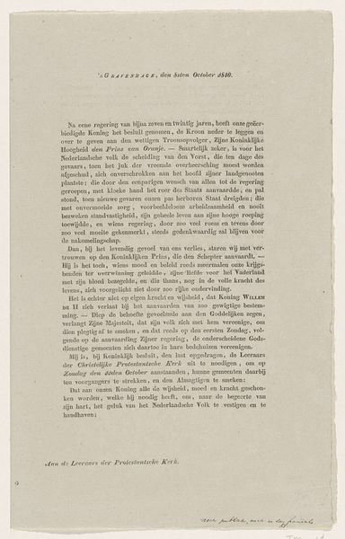
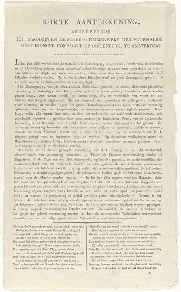
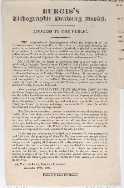
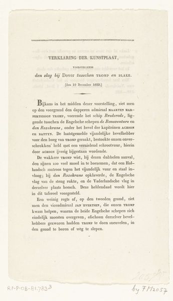
This farewell letter by R.W.P. de Vries Jr, was printed in November 1929, likely using a letterpress. The layout is pretty simple, centered with wide margins, and the font feels both classic and a bit formal, like a well-tailored suit. De Vries was writing to say goodbye to his role at Elsevier's Maandschrift, and the letter is almost like a quiet painting with words. It’s not splashy, but there’s a real care in how it’s put together. The choice of paper, the spacing, it all adds up to a feeling. It's kind of unassuming, but there's a thoughtfulness to the presentation. It reminds me a little bit of some of Agnes Martin’s grids, or On Kawara's date paintings. You know, work that is about something very specific and process-oriented, but also has a real human touch. Like a whisper instead of a shout. Art doesn’t always have to be loud to be powerful.
Comments
No comments
Be the first to comment and join the conversation on the ultimate creative platform.
More like this