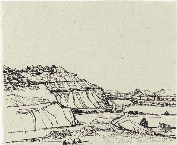
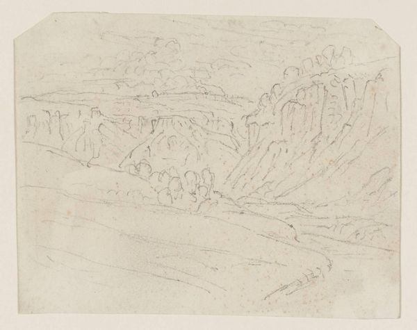
drawing, paper, ink, pencil
#
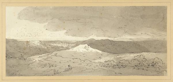
drawing
#
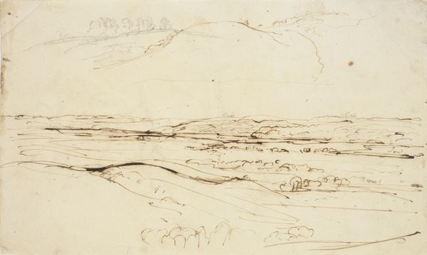
pen sketch
#
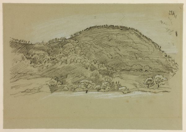
pencil sketch
#
landscape
#
paper
#
ink
#
pen-ink sketch
#
pencil
#
line
#
realism
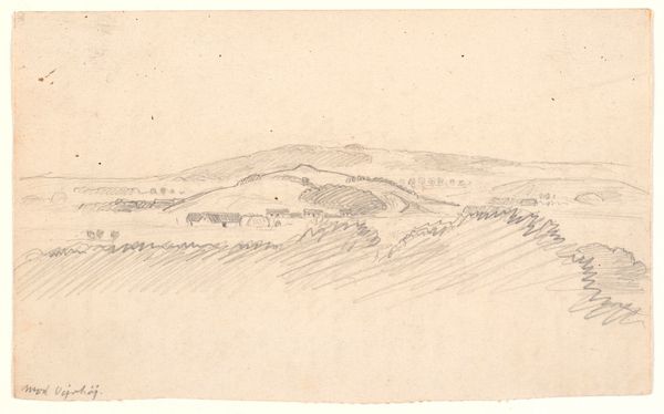
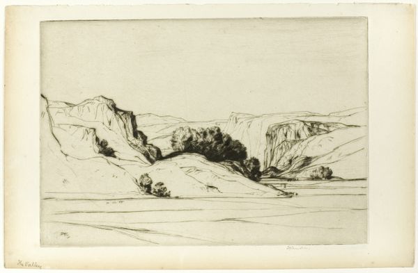
Dimensions: height 200 mm, width 300 mm
Copyright: Rijks Museum: Open Domain
Editor: Here we have Rein Dool's 2004 drawing, "Eja de Caballeros," rendered with ink and pencil on paper. The somber tones create a rather bleak atmosphere, and the landscape, while simple, has a strong sense of depth. What do you make of it? Curator: The initial impression is defined by the linearity. Consider how Dool uses line – the distinct marks and varying pressures – to delineate form and texture. It’s less about replicating the scene before him and more about constructing it through a visual language. Editor: So you’re drawn to the technique itself? Curator: Precisely. Observe how the cross-hatching and contour lines not only describe the topography, but also suggest the very essence of the landscape's structure. It gives an idea of volume using the relationship between the materials, pencil and ink, and their varying effect when used with pressure. The paper provides texture that would change depending on its treatment. Editor: That makes sense. I initially saw the scene as flat, but the lines do create depth. Curator: And how does the limited palette, the near monochrome, contribute? Is it mere economy, or is something more being communicated through that restraint? It directs our eyes towards line and shape and shadow; therefore the use of pencil and ink serves to bring out the texture more deliberately. Editor: It makes me appreciate the small nuances. I now realize there's a tension between the rough sketchiness and the almost photographic quality of the work as a whole. Thank you for guiding me through that. Curator: A pleasure. It is a lesson to be mindful of how a drawing's very qualities affect what we comprehend.
Comments
No comments
Be the first to comment and join the conversation on the ultimate creative platform.
More like this