drawing, ink, pen
#
portrait
#
drawing
#
script typography
#
hand-lettering
#
hand drawn type
#
hand lettering
#
personal sketchbook
#
ink
#
hand-drawn typeface
#
pen-ink sketch
#
pen work
#
sketchbook drawing
#
pen
#
post-impressionism
#
sketchbook art
#
miniature
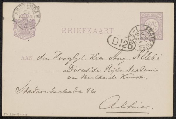
Copyright: Rijks Museum: Open Domain
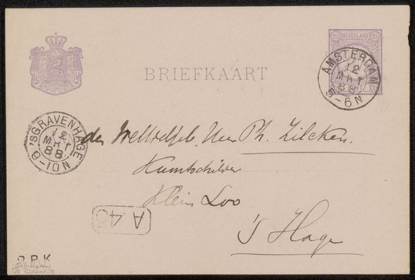
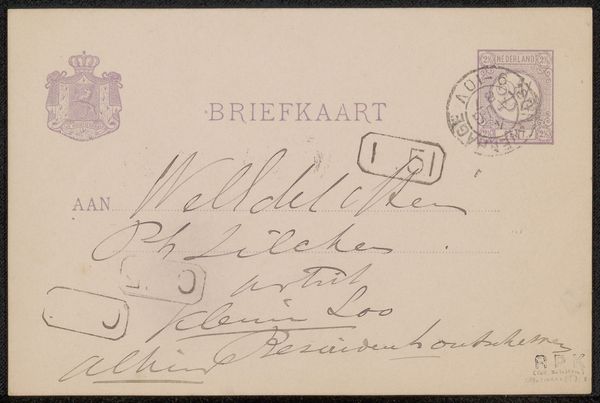
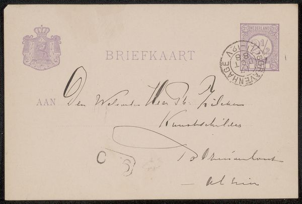
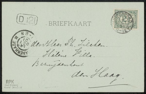
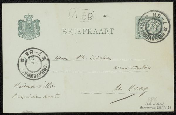
Curator: Here we have Suze Robertson's "Briefkaart aan Philip Zilcken," a little gem created before 1889. It's an ink drawing, a humble postcard turned into something far more evocative. It makes me wonder, what untold stories reside within its delicate lines? Editor: It strikes me as so fragile, this single sheet carrying a whole world. The stamp in the corner, the crest, all suggest a bureaucracy in miniature. It makes me think about the labor involved in sending even the simplest message at the time. Curator: Precisely. Robertson's decision to use a commonplace object elevates the everyday. I get a feeling that it isn’t just the functional aspect that is explored here but a touch of emotion, wouldn't you say? Like she turned ordinary communication into art. Editor: Agreed. The act of physically writing, the specific pressure of the pen creating thick and thin strokes...you can feel her hand present in every curve of the lettering. There's a very intimate feeling. Were these personal notes common as a canvas then, I wonder? Curator: The way she layers text, plays with its weight and flow, gives a very intimate and immediate effect, as if catching a passing thought. Like glancing at a page torn from a personal sketchbook. Each swirl seems to hold a secret, a half-whispered confidence. Editor: That notion of confidence…even the materials themselves suggest something. The humble ink, the mass-produced postcard: making a message tangible was far from straightforward or instant then. She brings attention to that effort. I love that contrast. Curator: Thinking of messages: she wasn't just documenting; she was almost *conjuring* an experience, right? That to me adds magic, or maybe I am reading a little too much into a casual mail. Editor: Perhaps! But that's the beauty, isn't it? We can project our own interpretations onto these echoes from the past. It gets me considering how the value we now put on “originality” shifts as the means and materials shift. Curator: True! Overall, considering its origins and artistic merit, what began as the simplest message ended up carrying more meaning than ever intended, echoing feelings even for today's eyes and ears. Editor: It does show, in such a small space, so much effort put into materializing a communication. It invites me to think more broadly about accessibility, effort, and meaning in artmaking itself.
Comments
No comments
Be the first to comment and join the conversation on the ultimate creative platform.
More like this