Dimensions: height 330 mm, width 208 mm
Copyright: Rijks Museum: Open Domain
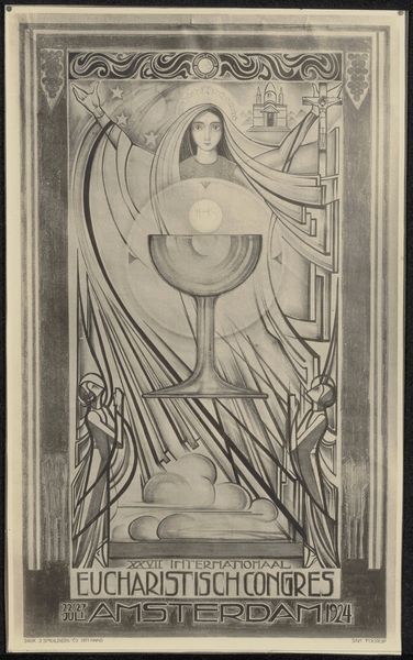
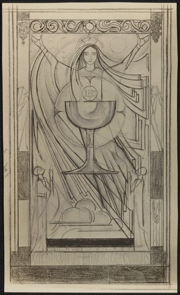
This poster for the 1924 International Eucharistic Congress in Amsterdam was made by Jan Toorop, and it’s all about the process, you can tell. It’s like he’s thinking out loud with color. Look at the way the lines aren’t quite perfect, and how the colors bleed a little. There’s this real sense of him figuring it out as he goes. The blue pencil he uses, not quite filling the edges of the frame, gives a raw, immediate feel. This makes the image seem less like a perfect icon and more like something tangible and human. It reminds me of Klimt, with the repeating border motifs. But where Klimt is precise and polished, Toorop is approachable and real. The poster celebrates not just the event, but the act of creation itself. It’s this constant conversation between artists across time. It’s about the endless possibilities of how we see and what we make.
Comments
No comments
Be the first to comment and join the conversation on the ultimate creative platform.
More like this