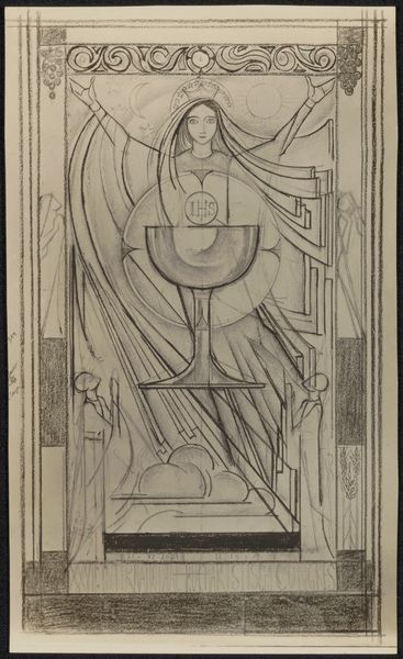
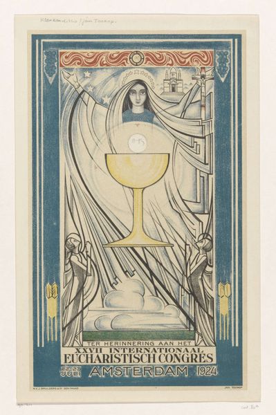
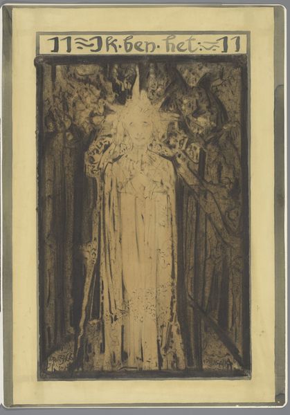
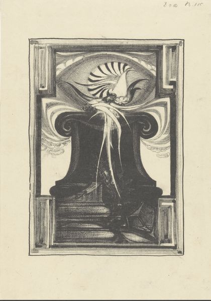
Fotoreproductie van een affiche voor het zevenentwintigste Internationaal Eucharistisch Congres after 1924
0:00
0:00
anonymous
Rijksmuseum
Copyright: Rijks Museum: Open Domain
Editor: This is a reproduction of a poster designed for the International Eucharistic Congress held in Amsterdam in 1924. It's rendered in pencil or charcoal and the style feels very Art Deco. I find it compelling because the design has so many distinct, symbolic areas. What symbols strike you as significant? Curator: It is absolutely steeped in symbolic imagery. First, notice the central chalice; it immediately draws our eye. It's not merely a cup, is it? What lies above it? Editor: The Eucharist wafer... It almost glows. Curator: Exactly! Now, observe the figure behind it. With her arms open, could she represent the Virgin Mary, but perhaps also Ecclesia, the personification of the Church? See the church and the crucifix? The artist layered traditional religious iconography within the then-contemporary Art Deco style to create a culturally relevant and striking poster. The geometric style serves a crucial function as an ordering principle for chaos, creating structure to understanding. Editor: That's fascinating! The lines and geometric shapes, rather than detracting from the spiritual elements, amplify the message by adding a modern sensibility. Curator: Precisely! It reflects a specific moment in time. Religious iconography, architectural forms, a visual representation of faith as a dialogue between old and new, all in one drawing. Editor: I see so much more now than when I first looked at it. The artist skillfully wove tradition with modernity, and the symbolism creates layers of meaning I initially overlooked. Curator: Indeed, visual language speaks across time. Each image element is culturally significant.
Comments
No comments
Be the first to comment and join the conversation on the ultimate creative platform.
More like this