Copyright: CC0 1.0
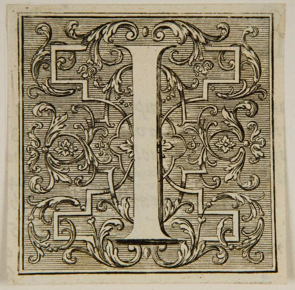
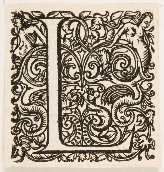
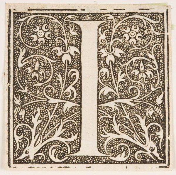
Editor: Here we have "Letter I", an undated print by an anonymous artist, part of the Harvard Art Museums collection. The intricate foliage surrounding the letter gives it a decorative feel. What strikes you about its composition? Curator: The stark contrast between the black ink and the bare paper creates a compelling visual tension. Note how the curvilinear forms of the foliage are carefully balanced against the strict verticality of the letterform. The negative space is as crucial as the positive form in establishing structure. Editor: I see what you mean about the balance. It's like the negative space almost fights for dominance. Curator: Precisely! And this tension creates a dynamic visual experience. A testament to the artist's careful consideration of form and void. I find it quite interesting, don't you? Editor: I do now! It's amazing how much you can see when you really look at the interplay of lines and shapes.
Comments
No comments
Be the first to comment and join the conversation on the ultimate creative platform.
More like this