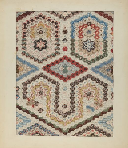
drawing, painting, watercolor
#
drawing
#
art-nouveau
#
painting
#
watercolor
#
tile art
#
geometric
#
watercolour illustration
#
decorative-art
Copyright: Rijks Museum: Open Domain
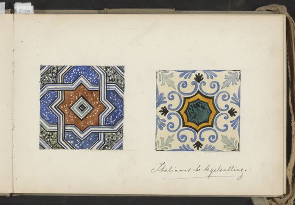
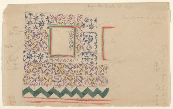
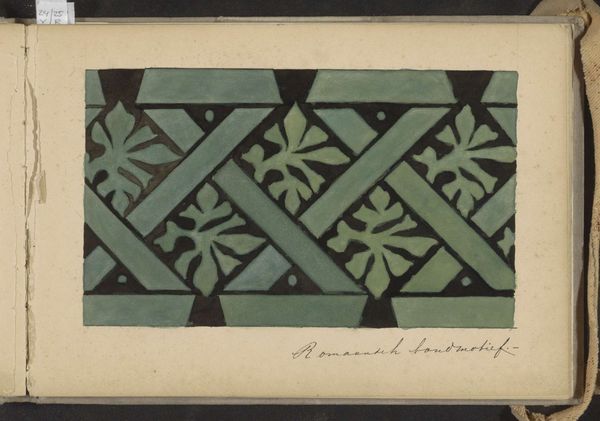
These "Italiaanse Majolicategels" were made by Johanna van de Kamer, we don't know exactly when, but it must have been before 1922, when she died. It looks like they were made with watercolors. The drawing is so precise, and each color fills its space with a lovely flatness. Look at the tile on the right, and especially how the light blue lines create a kind of scaffolding around the other colors and shapes. It makes me think about the way we construct images from simple elements, like letters to make words, or lines to make shapes. There's something really satisfying in the way these different colors work together. This piece reminds me of Hilma af Klint's work, which also used precise lines and flat colours, but in a completely different context. It's funny how different artists, working in different times and places, can still be in conversation with each other through their art. Ultimately, what these tiles mean is up for grabs - and that's what makes them so interesting.
Comments
No comments
Be the first to comment and join the conversation on the ultimate creative platform.
More like this