graphic-art, print, poster
art-deco
graphic-art
geometric
print advert
poster
Copyright: Cassandre,Fair Use
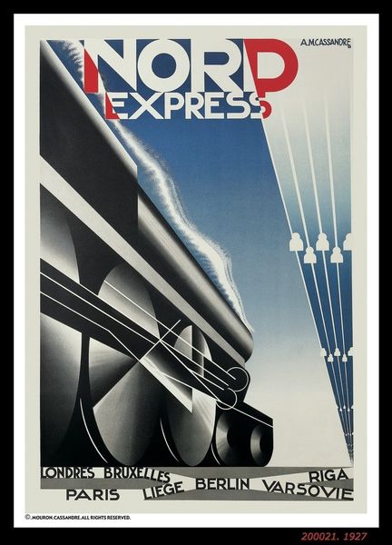
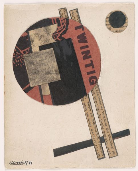
Editor: This poster, simply titled "Londen," by Cassandre, dates back to 1928. The print work makes bold use of geometry. What do you see in this piece from a formalist perspective? Curator: Indeed. Note the striking dichotomy. The locomotive's form is fractured by strong diagonal lines, segmenting the image into contrasting fields of light and shadow. This sharp division forces our eye to oscillate between the representational elements and the abstract geometry. Editor: It’s quite striking how the simplified forms still clearly convey a train. What does the use of color contribute to the composition? Curator: The palette is constrained, yes? Notice the primary colors of the locomotive's smokestack—red and blue—are grounded by the earthy tones. This controlled chromatic range directs focus to the central image while the text below is rendered in muted browns, establishing a hierarchy within the overall design. Editor: It seems less concerned with realism and more with… presenting a sense of speed or modernity? Curator: Precisely. The composition privileges dynamism through geometric simplification. Do you see how the implied motion isn't necessarily literal, but rather a visual metaphor for the excitement of travel in a modernizing world? The forward thrust is suggested rather than depicted, yes? Editor: Absolutely. I now see the sharp lines and limited palette work together to generate an exciting image through these shapes alone. Thank you! Curator: And you, for sharpening my vision today! The way graphic elements create an energy, regardless of subject, is a potent tool to analyze.
Comments
No comments
Be the first to comment and join the conversation on the ultimate creative platform.