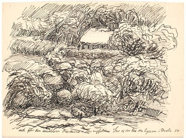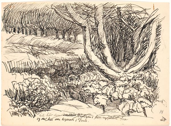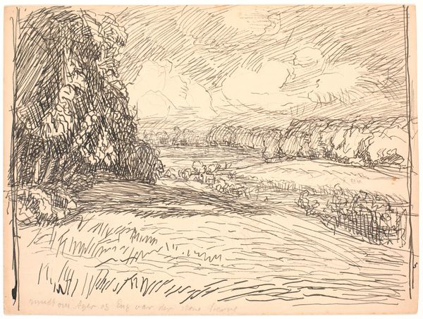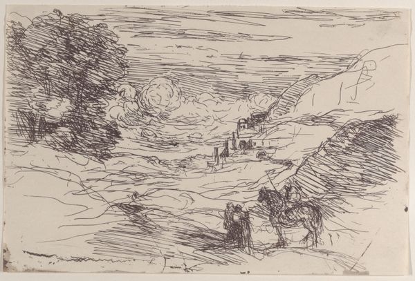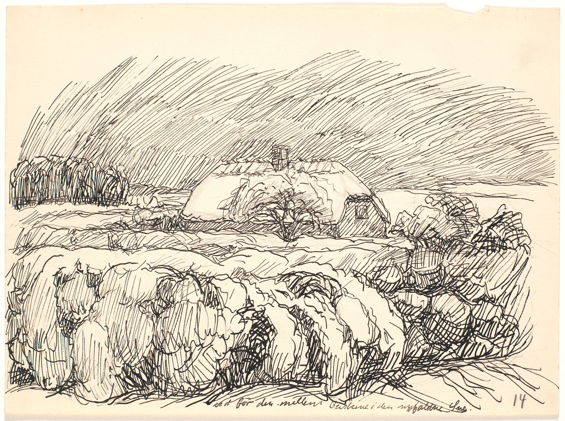
1928
Ud for den mellem Buskene...
Listen to curator's interpretation
Curatorial notes
Fritz Syberg created "Ud for den mellem Buskene..." with ink on paper. Look at how he makes marks; they’re all scratches and scribbles, like he’s trying to find the image rather than just copy it. It’s all about the process of searching. The texture in the piece is all in the lines. Notice how the sky is just a mass of hatched lines. Syberg gives everything the same kind of attention; whether it’s the bushes in the foreground or the roof of the building, it’s all just a network of scratches, and that gives the work a real feeling of liveliness. Take a look at the lower left corner. See how those bushes are just squiggles on top of squiggles? I love that, because Syberg is not trying to trick us into thinking we’re looking at real bushes. Syberg reminds me a bit of Van Gogh, especially in the way he uses line to create texture and movement. Both artists seem interested in ambiguity over photographic likeness.