aquatint, painting, print
#
aquatint
#
painting
# print
#
landscape
#
coloured pencil
#
genre-painting
Dimensions: 134 mm (height) x 190 mm (width) (bladmaal), 115 mm (height) x 170 mm (width) (plademaal), 93 mm (height) x 152 mm (width) (billedmaal)
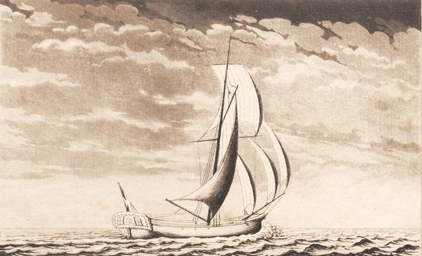
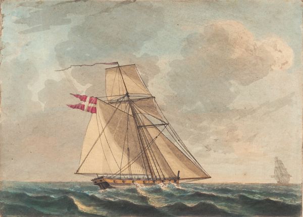
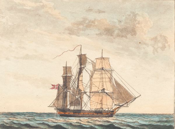
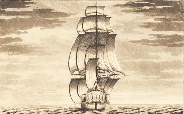
Curator: This aquatint by J.F. Clemens, titled "Suite af skibe", likely made between 1748 and 1831, offers us a captivating, if somewhat subdued, seascape. Editor: It feels incredibly somber, doesn’t it? The greyish-brown palette dominating the sky almost oppresses the single ship trying to navigate through. There is a certain elegance but weighted by melancholy. Curator: Note the careful layering of aquatint washes and how that achieves depth in both the sky and water. The structural rhythm established through the undulating clouds against the more linear waves below, really captures the dynamism between atmosphere and maritime space. Clemens has balanced the composition effectively with a single ship cutting a diagonal line across the scene. Editor: And this invites the question of context. Was this single ship depicted alone on the sea alluding to Denmark’s maritime power? Was this at a time when naval conflicts and trade played a critical role in national identity? It begs a consideration beyond the aesthetic. Were individual sailors on this kind of vessel seen and recognized by society and the government, or only recognized by the people within their class? What could the lack of companionship on the seas really entail? Curator: The formalism through which the artist deploys various techniques reveals something beyond its mere illustrative properties, beyond the identity politics that surround class—it’s a study in the poetics of space. Notice how the sail curves to push back into the distance behind it, pulling you, the viewer, towards a destination on the horizon, even while its overall stillness and symmetry of form keeps it present. Editor: I concede that, yes, there is something intensely evocative in how that singular vessel contrasts with its expansive setting. Curator: The play of line and wash creates a strong illusion. To fully appreciate the skill here, one should observe the formal, painterly decisions, the strategic deployment of tonal variation—it speaks eloquently to its technical facility as a print. Editor: And by taking the aesthetic considerations you highlighted and then connecting them to potential social histories and material concerns like economic mobility, the piece reveals a far more complicated story about Danish identity. Thank you for guiding me on this. Curator: It’s in these discussions, drawing from technique and history, that allows one to really appreciate this seemingly modest, yet powerful work.
Comments
No comments
Be the first to comment and join the conversation on the ultimate creative platform.
More like this