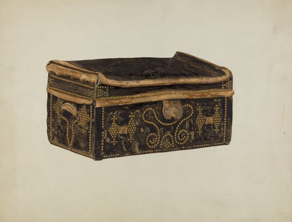
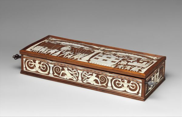
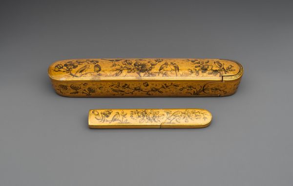
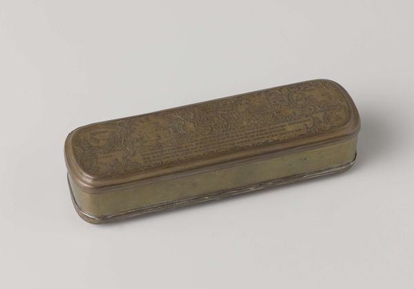
Brillendoos van dik papier met donkerbruin leer bekleed en bedrukt met vergulde florale ornamenten c. 1710 - 1725
0:00
0:00
metal, wood
#
baroque
#
metal
#
wood
#
decorative-art
Dimensions: length 19.8 cm, width 5.0 cm, height 3.0 cm
Copyright: Rijks Museum: Open Domain
Curator: Here we have a spectacles case crafted around 1710-1725, known as "Brillendoos van dik papier met donkerbruin leer bekleed en bedrukt met vergulde florale ornamenten." It's attributed to Jan van Musschenbroek. Editor: The floral patterns immediately strike me; they bring a sense of opulence despite the small scale. I also see that the box is trimmed with what appears to be small circular golden motifs along all the edges. Curator: Right, but it is the historical implications of these “florale ornamenten” that speak most profoundly. This was an era defined by emerging capitalist economies, and a global trade boom between colonizing powers such as the Dutch, Portuguese, and Spanish. As such, in addition to beautifying items with new forms and materials such as gold trim or leather coating, the ornament also communicated social power of their commissioners by literally incorporating abstracted images from the colonial landscape. Editor: I'm interested in the box's structure. It is wood covered with what appears to be a dark brown leather. The leather provides a ground against which the floral patterns stand out, the details of each are rendered exquisitely through careful consideration to symmetry and spatial distribution. And what's that lining it? Is it velvet? Curator: Yes, I do believe it’s a darkly colored velvet. And understanding the velvet interior also necessitates unpacking what role the case may have played beyond simply “containing.” Given the status symbol one gained via commissioning, manufacturing, and importing ornate items like this box and glasses from colonially available resources, we see it is as much a means of containment, as it is about social, gender, and race politics. How do glasses shape vision? What does seeing or wearing colonial glasses say about its wearer’s colonial biases? Editor: Interesting points to consider. It also seems like the artist had to balance the interplay between texture and surface. The leather’s smooth, dark surface serves as a grounding canvas that amplifies both depth, scale, and tension across the ornamental elements—it’s almost baroque. Curator: The choice of dark paper combined with deep brown leather does feel a bit subversive, doesn't it? There’s a tension here; it uses all this baroque design, while hinting at mortality and darkness that feels prescient to issues of race, gender, and class. Editor: Precisely, and it provides a lens, if you will, into this period and its complex artistic choices. Curator: And perhaps forces us to reexamine, if only for a brief moment, the function of visual artifacts, ornamental patterns, design and power structures, as it stands to intersect today.
Comments
No comments
Be the first to comment and join the conversation on the ultimate creative platform.
More like this