print, etching, engraving
#
medieval
#
dutch-golden-age
# print
#
etching
#
landscape
#
cityscape
#
engraving
Dimensions: height 217 mm, width 275 mm
Copyright: Rijks Museum: Open Domain
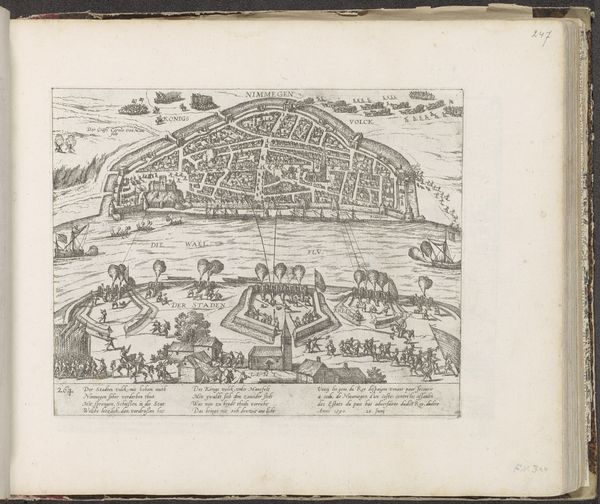
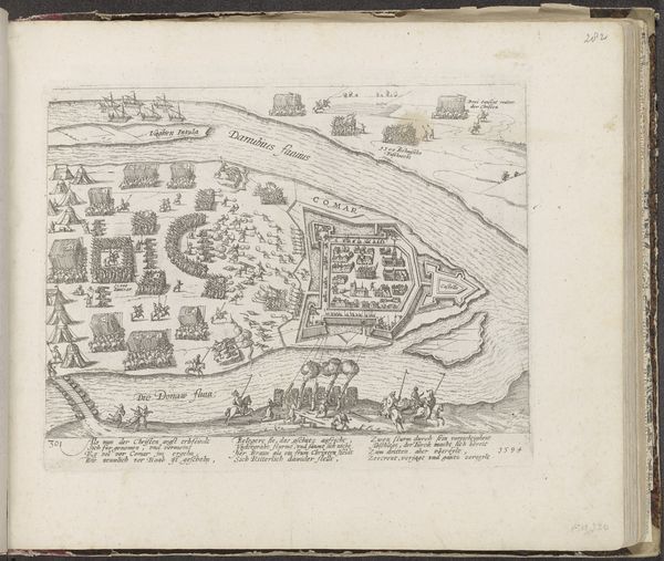
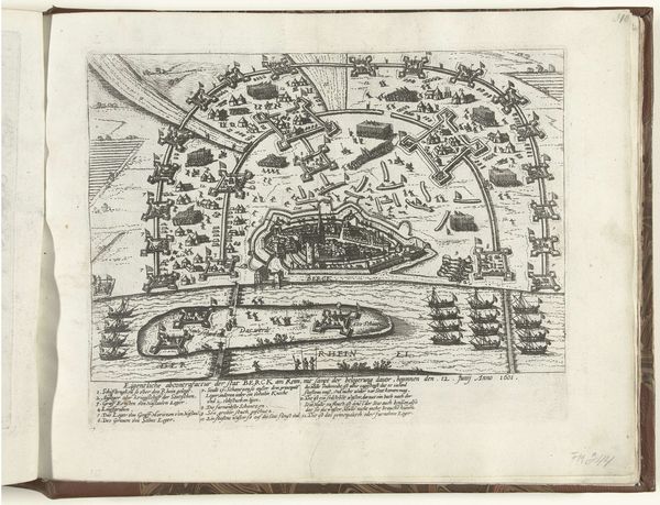
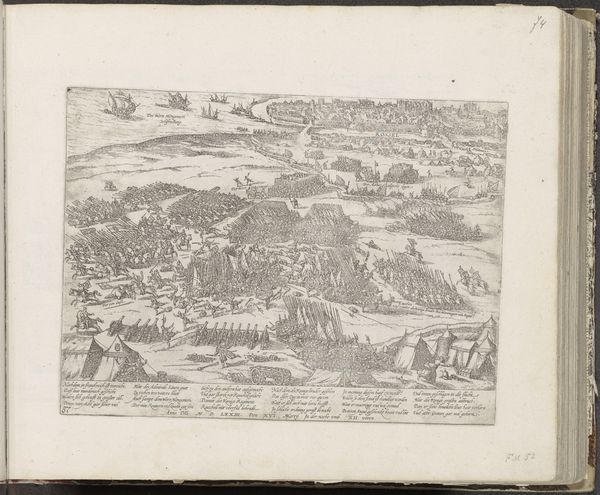
Curator: The image before us is an engraving titled "Aanleg van schans Papenmuts op Kompenwerdt, 1620," made between 1620 and 1622 by Frans Hogenberg. It's currently held in the Rijksmuseum collection. Editor: It gives such a meticulous overview. A stark landscape bisected by this wide river, with a fortified island smack in the center. Everything's so carefully delineated in those sharp black lines. A real sense of calculated order imposed on nature. Curator: Indeed. Hogenberg’s expertise with engraving truly captures the Dutch Golden Age preoccupation with detailed cartography and recording contemporary events. He's essentially providing a visual document of military engineering. Editor: So the subject is military, but how do we think the imagery is intended? Because to a modern eye it comes off very flat. The horizon lines flatten, everything gets the same amount of attention, there isn't much hierarchy of meaning between all these small details competing for space on the plate. Curator: The flattening, though, lends itself to that sense of objective, almost scientific observation typical of the era. Note how each building, each tree, the arrangement of boats, they're all rendered with incredible precision and without any overt emotional gesturing. It's a demonstration of control. The starkness in a way, reinforces the intent to capture a truth. Editor: I can't help thinking about the broader history, that there's so much colonial tension just under the surface. Even something that looks very "rational" like a bird's eye map hides plenty of interests and ideas about property. Curator: Exactly! Maps are never neutral. The composition leads your eye systematically through a very active space—suggesting a well managed and successful venture on display. What did you make of the placement of text on the image itself? Editor: Oh, the script is almost like an added layer of analysis. Giving more support to the whole document and also filling up blank spaces in an appealing fashion, that keeps drawing attention into this contained frame of information. Curator: So even through a primarily visual language, there is persuasive, guiding information, influencing its audience, just beyond the surface. Editor: In considering the visual grammar and historical framework it operates in, one comes away with a much deeper sense of this work. Thank you for your insight into it!
Comments
No comments
Be the first to comment and join the conversation on the ultimate creative platform.
More like this