acrylic-paint
#
abstract-expressionism
#
op art
#
pop art
#
colour-field-painting
#
acrylic-paint
#
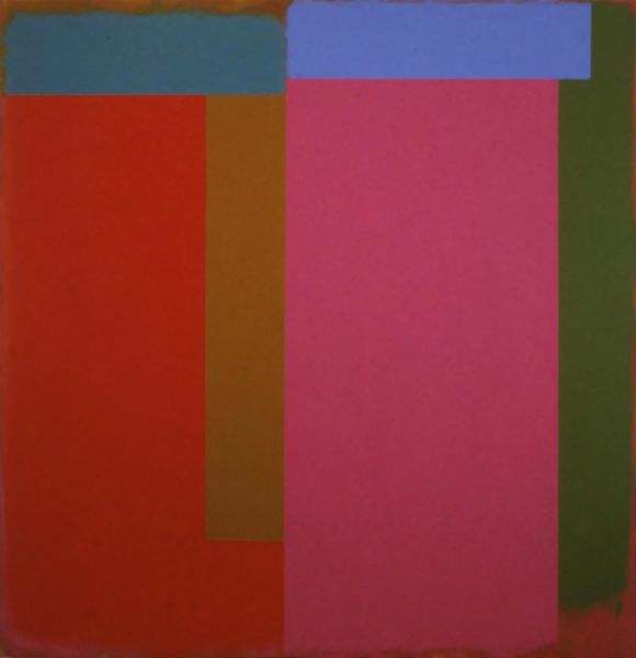
geometric-abstraction
#
abstraction
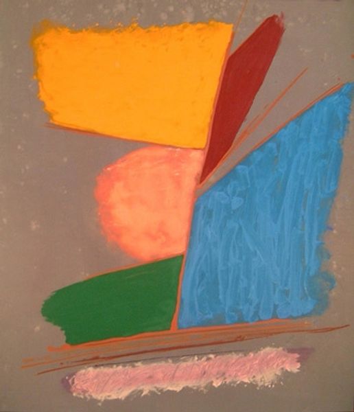
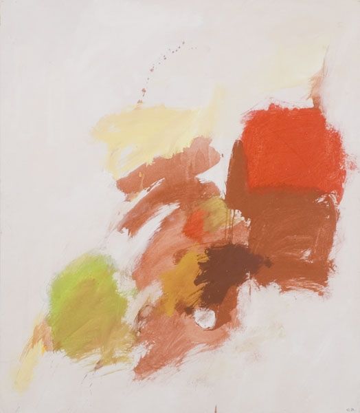
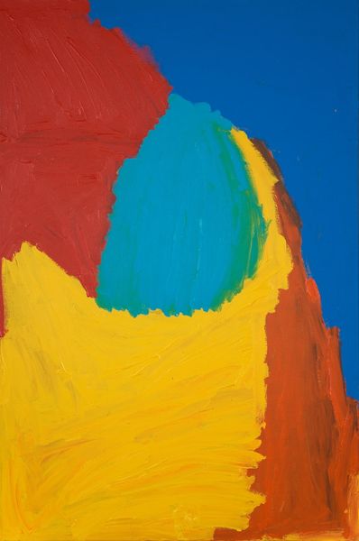
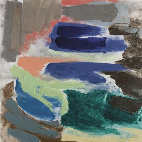
Copyright: Ray Parker,Fair Use
Ray Parker made this untitled painting with confident, almost cartoonish brushstrokes. He was interested in how colors interact, and he applied them in simple, bold shapes that hover against a pale ground. The paint application looks straightforward. There aren't a lot of fussy details, but the colours are layered on in such a way that each form has its own distinct energy. The surprising combination of red, brown, blue, and green against the pale background creates a dynamic tension. Look at the way the red shape at the top seems to push forward, while the blue and green forms below feel more grounded. It's like a little drama is unfolding right before your eyes. Parker’s work reminds me of Milton Avery, another artist who was interested in simplifying forms and exploring color relationships. But where Avery’s work often feels quiet and contemplative, Parker’s has a more playful, energetic quality. It is a conversation between friends, where ambiguity and multiple interpretations are welcome.
Comments
No comments
Be the first to comment and join the conversation on the ultimate creative platform.
More like this