graphic-art, print, paper, typography, poster
graphic-art
paper
typography
poster
Dimensions: height 24 cm, width 31.5 cm
Copyright: Rijks Museum: Open Domain
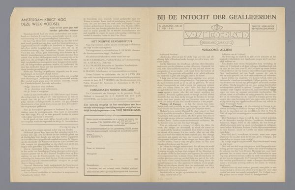
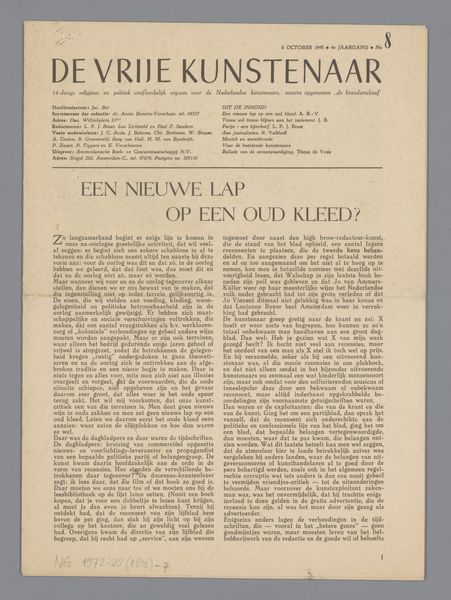
Curator: Here we have "De Vrije Katheder," which translates to "The Free Pulpit," a poster published possibly in 1946 by the foundation of the same name, Stichting De Vrije Katheder. Editor: The design itself has a sturdy, almost architectural feel. I see the typography and paper as distinctly postwar, with that earnest, striving simplicity to it. The blocky letters seem rooted and forward-looking all at once. Curator: The publication championed free artistic expression in the aftermath of World War II. The name itself, "The Free Pulpit," hints at its mission—providing a platform for unbridled thought and creativity. It almost adopts the symbolism of a traditional religious center, transforming it into a space for secular, artistic exchange. Editor: Yes, and consider the material conditions! Paper was still likely rationed or precious. This poster's design leans heavily into the graphic, relying on impactful typesetting over lavish pictorial imagery, which would’ve demanded additional material and labor to reproduce. The blue seems pragmatic as well; a widely available pigment perhaps? Curator: The content listing at the bottom alludes to intellectual and political debates. One article discusses the writings of Henry Moore regarding Londoners living in shelters during the war. It subtly weaves threads of collective trauma and social responsibility into the fabric of the publication’s identity. Editor: The contrast between the monumental typeface of the title and the condensed content listings suggests a careful consideration of audience. It’s bold, eye-catching from afar, but dense and informational up close. A perfect blend of message and medium, really. You want people to pick it up! Curator: The poster encapsulates a critical moment—artists striving to rebuild and redefine the cultural landscape after devastation, yearning for expression and connection through accessible art. Editor: Absolutely. The constrained materials arguably heightened the focus on what *could* be controlled—typography and composition. "De Vrije Katheder" serves as a tangible testament to art emerging in times of limited resources, shaped fundamentally by those very limitations.
Comments
No comments
Be the first to comment and join the conversation on the ultimate creative platform.