#
aged paper
#
toned paper
#
water colours
#
pastel soft colours
#
coloured pencil
#
pastel tone
#
watercolour bleed
#
watercolour illustration
#
paper medium
#
watercolor
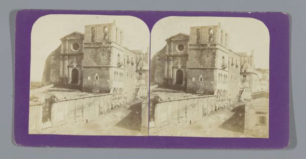
Dimensions: height 88 mm, width 176 mm
Copyright: Rijks Museum: Open Domain
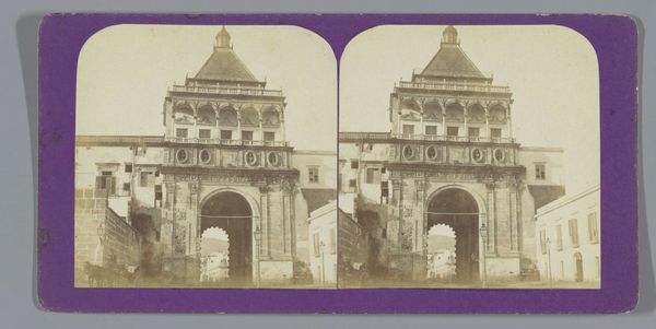
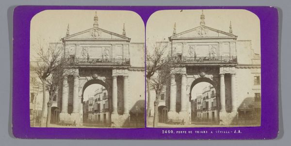
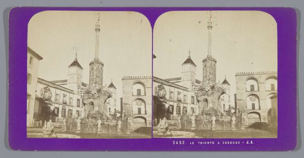
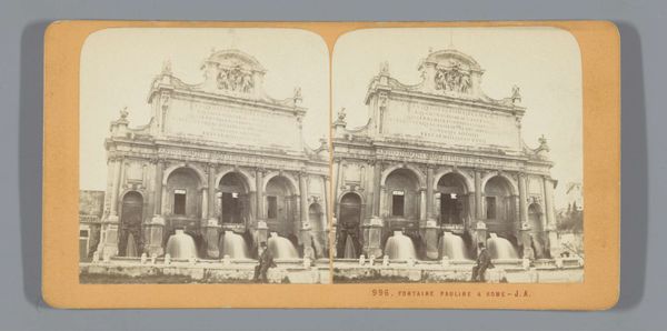
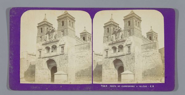
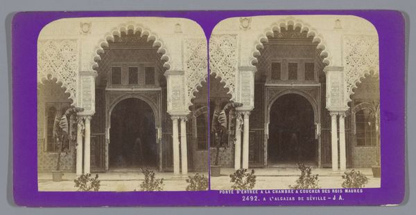
Editor: This stereograph card, “Gezicht op de kathedraal van Syracuse,” was created by Jean Andrieu between 1862 and 1876, utilizing watercolour and coloured pencil. The toned paper gives the image a nostalgic quality. How might we consider the context of these materials shaping our understanding? Curator: It's crucial to recognize that paper wasn't just a surface; it was a commodity produced and distributed through specific channels. The choice of toned paper, the way Andrieu applies the watercolour –notice the delicate bleed– these weren't merely aesthetic decisions. They reflect an engagement with the industrial processes transforming artistic production. How does this process differ from fresco? What does that shift enable in terms of image dissemination and audience access? Editor: That's interesting. So you're saying the materials themselves tell a story about accessibility and broader consumption of art at the time? It looks like some sort of cheap photograph sold as a souvenir, in a way? Curator: Exactly! These cheaper means of artistic production widened the scope of creation, and are now crucial elements of mass tourism. How might the accessibility afforded to the amateur, for example through the cheaper materials used here, blur the established lines dividing high art and commodity? Editor: I see, this small card made from these simple materials really challenges conventional art boundaries. I'm struck by how a materialist reading opens up our understanding. Curator: Indeed! Recognizing art's dependence on materials, production and social context provides a potent framework for analysis.
Comments
No comments
Be the first to comment and join the conversation on the ultimate creative platform.
More like this