Copyright: Modern Artists: Artvee
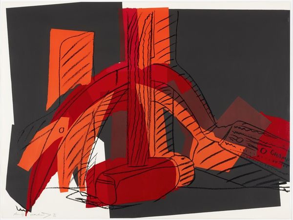
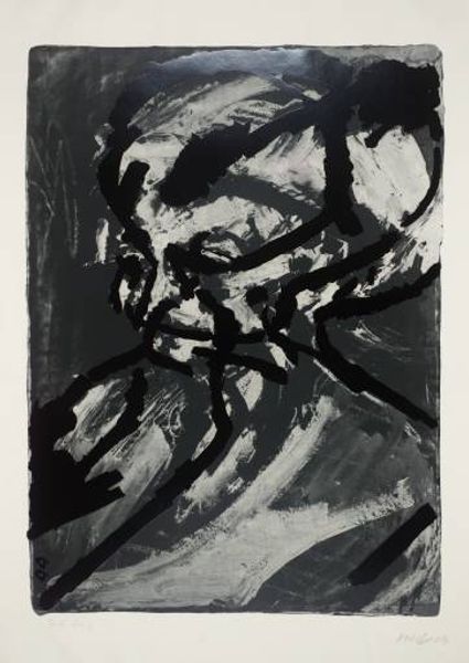
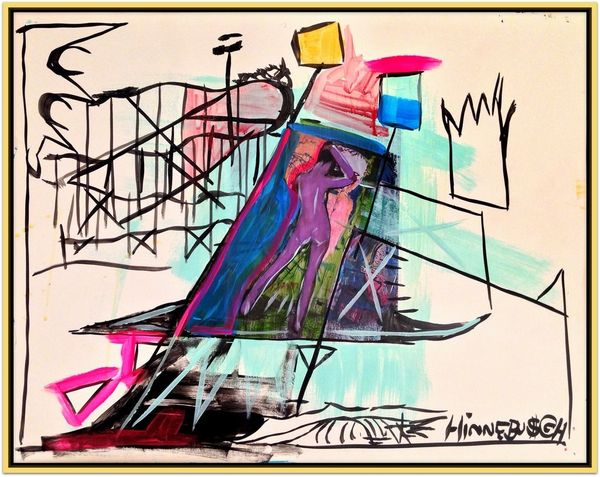
This is Andy Warhol’s screenprint, *Skulls #1*. I love the way Warhol’s mark-making is so visible in this piece, it’s not trying to hide the process, right? There's this real push and pull between the graphic quality of the screen print and the more expressive elements. Look at the skull itself, how the solid green block is overlaid with these wiggly black lines. It's like a doodle, but it's got this super serious subject. The blocks of colour are almost cartoonish but they create an eerie kind of depth. And then you have the gray and blue blocks, kind of floating on top of everything else. Warhol was all about repetition and reproduction, so this image feels like a reminder that art doesn’t always have to be precious. I'm reminded of Francis Picabia's playful approach to painting. Art is a conversation, a game of telephone across time.
Comments
No comments
Be the first to comment and join the conversation on the ultimate creative platform.
