Curatorial notes
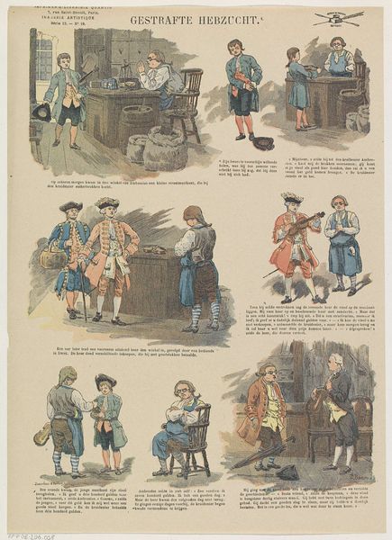
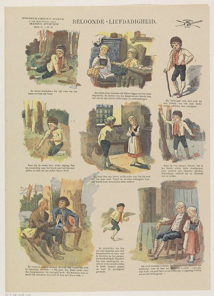
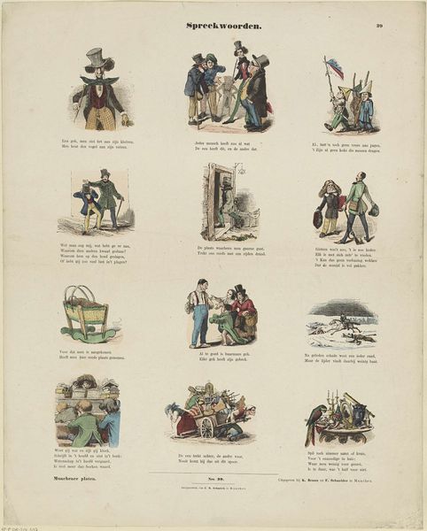
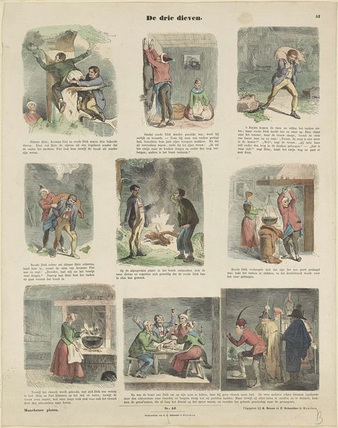
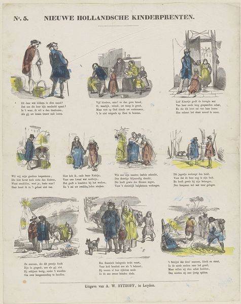
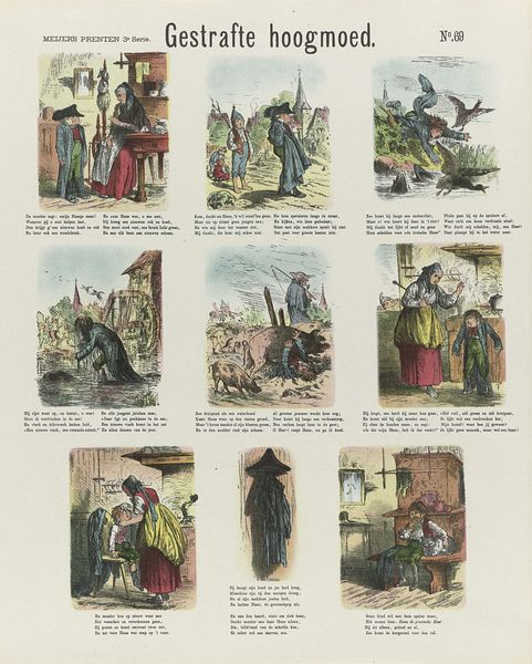
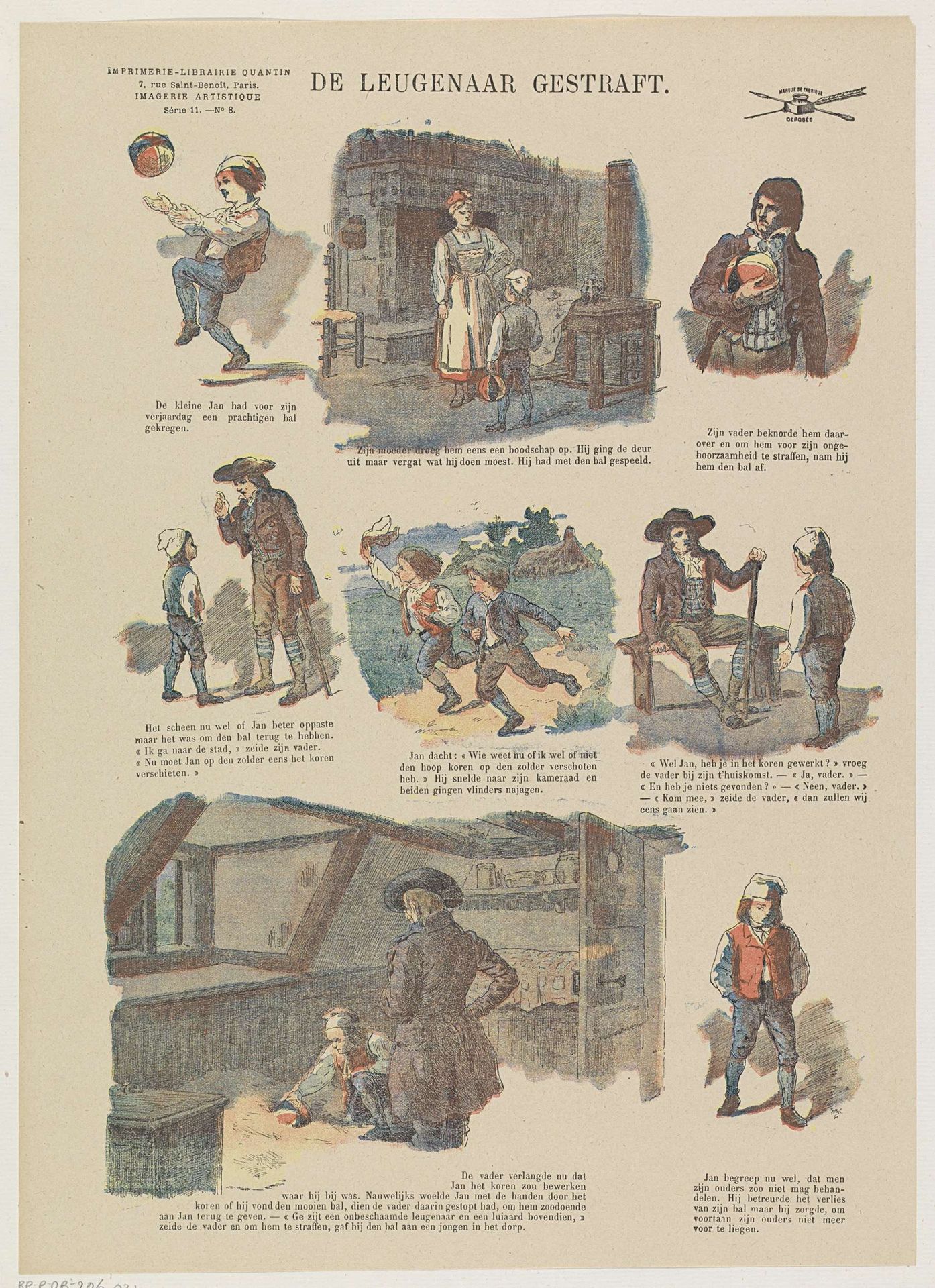
Editor: Here we have "De leugenaar gestraft", or "The Liar Punished," created between 1876 and 1893 by Albert Quantin. It's a pen and ink drawing, maybe a print or even a watercolour illustration. It seems to depict scenes from a cautionary tale, all fit neatly together. How would you interpret the piece based on its structural components? Curator: Let us consider its compositional architecture. Quantin employs a grid-like arrangement, dividing the narrative into distinct vignettes. Observe how each scene is self-contained, yet connected by a consistent style. Notice the palette; subdued earth tones, with delicate washes of colour, create a sense of unified visual field. This echoes the emotional tonality that connects the segments in the print. Editor: I see the scenes as related but disparate—separated by subject as well as the little printed captions underneath. How does that tension shape our reading of the whole? Curator: Indeed. The formal separation enhances the narrative's didactic purpose. Each vignette functions as a self-contained lesson. This modular approach invites viewers to engage actively, deciphering the relationships and consequences across each of the components. The structural composition directs how we grasp Quantin’s intended narrative meaning. Editor: So you're saying the very arrangement underlines the message itself: that clear actions have specific and visible consequences? Curator: Precisely. Consider how each scene utilizes relatively simple geometric forms to create depth. Notice how these elements guide our gaze, underscoring the artist's manipulation of perspective. And what do we know about lying and truth in structuralism or philosophy? It’s a perfect match of form and function. Editor: That's interesting—how the artist used compositional tools and illustrative components, to show the artist’s vision and the themes explored in the print. Curator: Indeed, the construction mirrors and augments the reading experience, demonstrating how form can function as content itself.