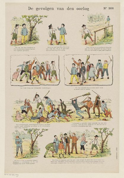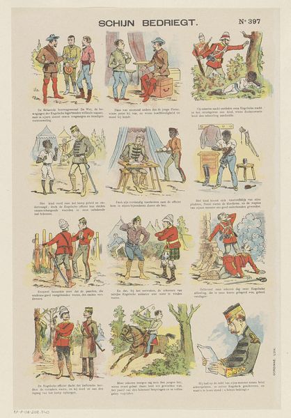
1894 - 1959
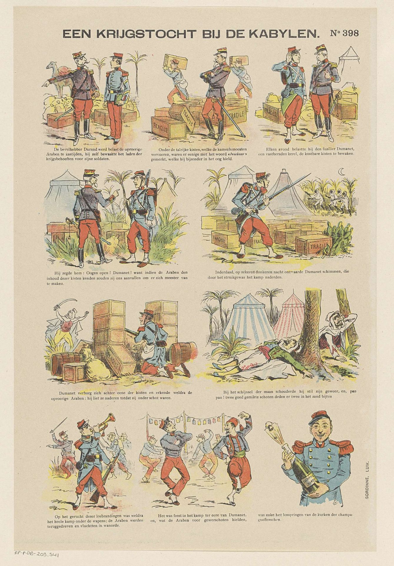
Een krijgstocht bij de Kabylen
Gordinne
@gordinneLocation
RijksmuseumListen to curator's interpretation
Curatorial notes
Gordinne made this print, Een krijgstocht bij de Kabylen, with lithography. It reminds me a little of comics, maybe because of the way the story unfolds in separate scenes. It's interesting how the artist uses a limited color palette, mainly reds, blues, and browns, to create a sense of depth and atmosphere. The flat color gives it a graphic quality, like a poster or even a page from a children’s book. There’s a real tension between the cartoon-like figures and the pretty serious subject matter - soldiers! I keep looking at the way the figures are outlined. The lines feel tentative, almost shaky, and you can tell there’s something human in that imperfect quality. It stops it from feeling too slick. It's like Gordinne is embracing the flaws in the process, letting the hand-drawn quality shine through. This reminds me of Philip Guston, who also used simple lines and colors to explore complex themes. Both artists remind us that art doesn't have to be perfect to be powerful. It's in the imperfections that we often find the most meaning.