#
low poly
#
low-poly
#
mixed mediaart
#
painted
#
oil painting
#
acrylic on canvas
#
spray can art
#
industrial style
#
urban art
#
3d art
Copyright: Public domain
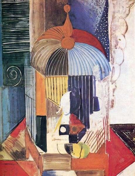
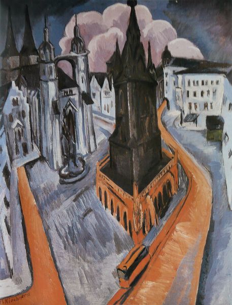
Charles Demuth made Welcome to Our City with oil, probably sometime in the 1910s or 20s. Demuth really puts the paint to work here, doesn’t he? It's not about hiding the process but flaunting it. Look at those sharp, clear lines creating geometric shapes. It’s like he’s dissecting the city into its most basic forms. I like the way he sets up the city; there is the dome of a grand building, but also a lot of red brick, reminding me of industrial spaces. The color palette, mostly reds and grays, feels very grounded, but then he throws in these curveball shapes behind the building, like confetti falling on the street! It reminds me a little bit of the Futurists and their love of industry. But Demuth's got his own thing going on, embracing a certain kind of ambiguity that is more about feeling than thinking. It's a welcome, but also a question. What do you think?
Comments
No comments
Be the first to comment and join the conversation on the ultimate creative platform.
More like this