1636
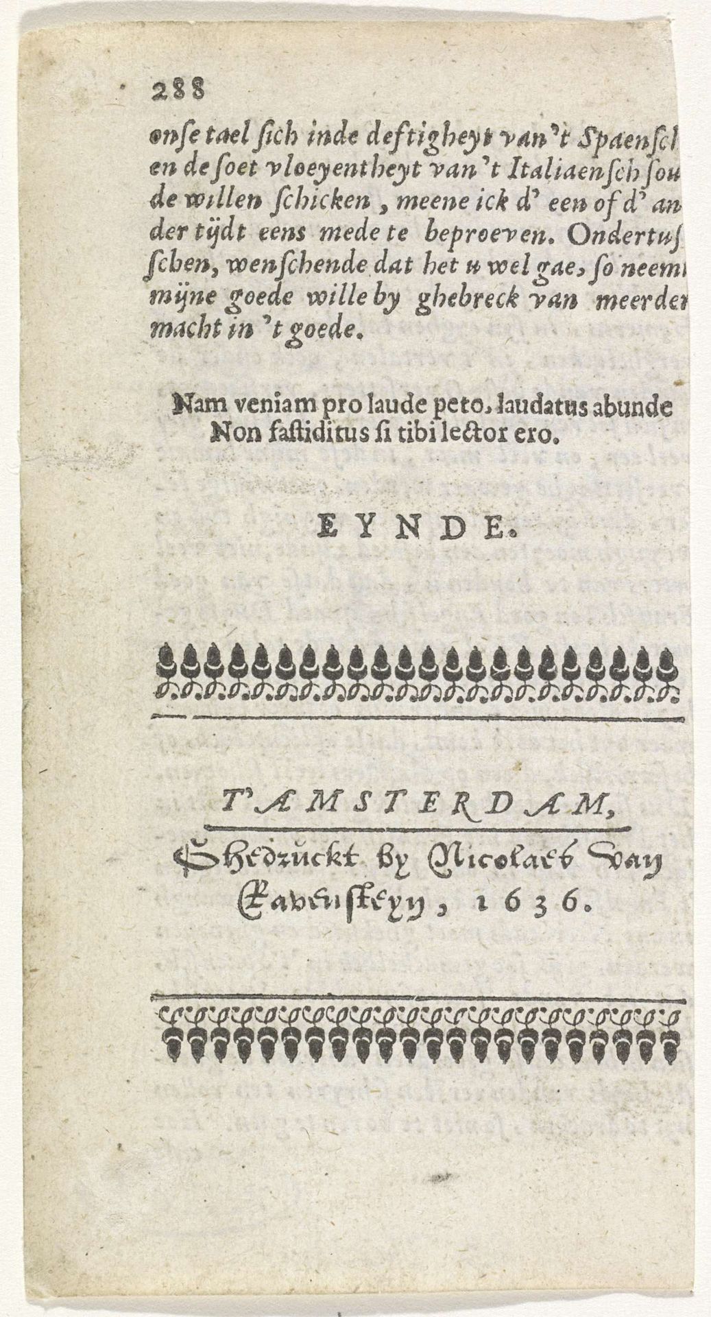
Blad uit een boek met adres van een uitgever
Nicolaes van Ravesteyn
@nicolaesvanravesteynLocation
RijksmuseumListen to curator's interpretation
Curatorial notes
Editor: So this piece is called "Blad uit een boek met adres van een uitgever," or "Page from a book with the address of a publisher" by Nicolaes van Ravesteyn, and it’s dated 1636. It’s an engraving, so lines of text on paper. The typography almost makes it feel like a pattern; it’s pretty, even. How do you interpret the symbolic language at play here? Curator: The typography absolutely functions as a pattern, framing the text. But look closer, those decorative elements are tiny images aren't they? Each era has particular visual codes. Knowing it’s a publisher's mark from the Dutch Golden Age provides rich symbolic context. Editor: Oh, I see it now – little teardrops? Curator: They resemble stylized tulips, or possibly flames—a rebus maybe indicating prosperity. More deeply though, think about what the act of publishing and circulating the written word means during this period. What cultural memory did it conjure, what feelings and associations were stimulated by it? Editor: Freedom of thought? Reformation ideas spreading? Curator: Precisely. In essence, we’re seeing not just a publisher's mark, but a statement about cultural power, the symbolism woven directly into the artistic expression of the page itself. What about the Latin quote in the center? Editor: "I seek pardon instead of praise. Praised enough if I shall not be tedious to you, reader.” That suggests a certain relationship between the publisher and its public. Curator: Exactly. It acknowledges the reader's role, the reciprocity inherent in circulating information. A good reminder that every image is a carefully constructed piece of communication. Editor: I see what you mean! So the "end" here marks not only a physical boundary, but a cultural threshold in terms of readership. I will remember to "read into" the iconography.