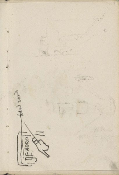
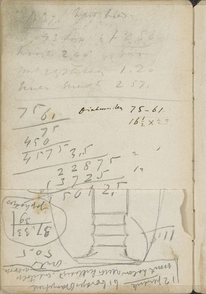
Ontwerpen voor een logo voor Uitgeversmaatschappij De Hooge Brug c. 1925
0:00
0:00
careladolphlioncachet
Rijksmuseum
drawing, paper, graphite
#
drawing
#
hand written
#
hand-lettering
#
hand lettering
#
paper
#
personal sketchbook
#
hand-written
#
geometric
#
graphite
#
modernism
#
calligraphy
Copyright: Rijks Museum: Open Domain
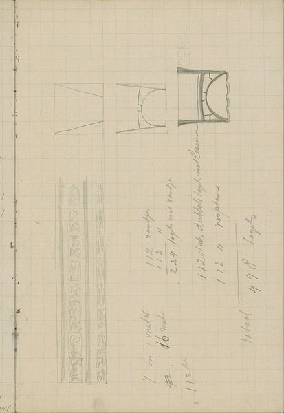
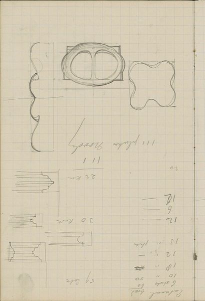
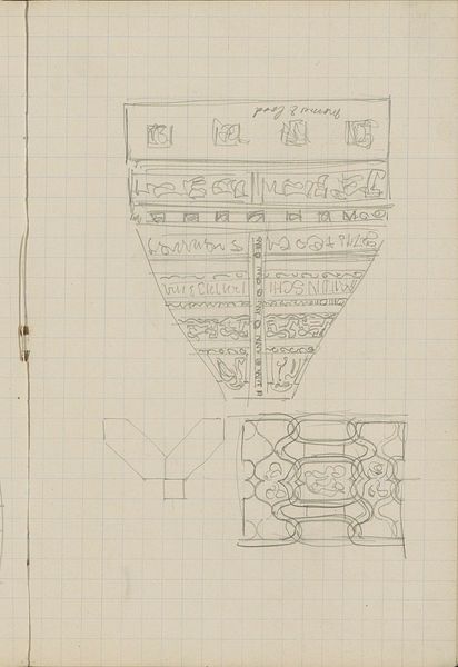
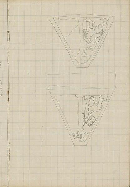
Editor: Here we have “Designs for a logo for Uitgeversmaatschappij De Hooge Brug,” from around 1925, by Carel Adolph Lion Cachet, made using graphite on paper. It seems to be a page of sketches with a few variations of a bridge design, and it’s surrounded by all sorts of hand-written notes. I’m struck by how geometric and stylized the bridge images are. What's your take on this piece? Curator: Well, it’s interesting to see design work presented in such a raw, almost utilitarian fashion. Look at the grid lines showing through the sketches, almost as if functionality and mathematical accuracy take center stage, rather than any sense of aesthetic embellishment. I think this reveals the societal values of the time period. Editor: How so? Curator: Consider that this logo design emerged during a period of significant rebuilding and societal restructuring after the First World War. The need for efficiency and practicality was paramount, especially in commercial ventures. So, this straight-forward logo design becomes part of a larger, more utilitarian sensibility shaping public imagery and branding during that time. How do you feel the artist balances commercial need with artistry? Editor: That's a really great point. I hadn’t considered the post-war context like that. I guess the artistry is perhaps sublimated in favor of clear communication, suggesting the publishing house, "De Hooge Brug" – the high bridge – is dependable and structurally sound. Curator: Exactly! The bridge symbolizes connection and passage, qualities valuable to a publishing house. The deliberate use of geometry conveys stability and order, reinforcing this message, something potentially reassuring in an era of rapid change. Editor: I never thought about a logo carrying so much historical and social weight! I'll definitely look at these design sketches with new eyes now. Curator: It’s amazing what we can unearth when we explore the layers beneath the surface, right?
Comments
No comments
Be the first to comment and join the conversation on the ultimate creative platform.
More like this