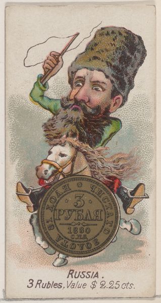
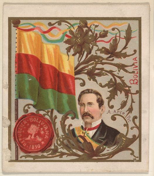
Peru, from the International Cards series (N238), issued by Kinney Bros. 1888
0:00
0:00
Dimensions: Sheet: 3 1/4 × 2 7/8 in. (8.2 × 7.3 cm)
Copyright: Public Domain
Editor: This is “Peru, from the International Cards series (N238),” printed by Kinney Brothers in 1888. It's a coloured-pencil print, surprisingly intricate for something intended as a collectible card. What initially strikes me is the way the composition crams so much into a small space – it's almost overwhelming! How do you interpret this density of images, this assembly of signifiers? Curator: Its density speaks volumes about the work's purpose. We must examine the formal relationships between the elements, divorced from overt symbolism. Notice how the artist compartmentalizes the composition using geometric shapes. The circular emblem featuring animals intersects with the stark lines of the flag. What effect does this layering create? Editor: It feels like a deliberate attempt to showcase Peru through symbolic representations. The layering... It makes it hard to isolate any single element, emphasizing their interconnectedness. It almost feels like an overload of patriotic imagery. Curator: Precisely. And the high saturation of colours, the vermilion of the flag contrasted against the teal backdrop, creates a visual tension. Do you observe any similar points of contrast elsewhere? Editor: Well, the detailed portrait of the General opposes the more diagrammatic rendering of the national seal... Is this a means of signifying specific leadership versus national identity? Curator: Perhaps, but consider also the materiality of the print. The coloured-pencil technique, particularly in the general's portrait, allows for fine textural detail that you don’t see elsewhere. The medium contributes to our reading. The variation in line quality leads to the hierarchy of forms, not their symbolism. Editor: So, by focusing on the visual contrasts in the colour, texture and organization, we can see it as more than just an advertisement; instead it’s a structured, though compact, display. Curator: Exactly. It demonstrates that even ephemera warrants detailed consideration of its intrinsic aesthetic values. Editor: I hadn’t considered the visual components in such depth. This formal breakdown really sheds a new light on what initially appeared as a straightforward piece.
Comments
No comments
Be the first to comment and join the conversation on the ultimate creative platform.
More like this