painting, acrylic-paint
de-stijl
non-objective-art
painting
acrylic-paint
geometric
abstraction
modernism
Copyright: Public domain
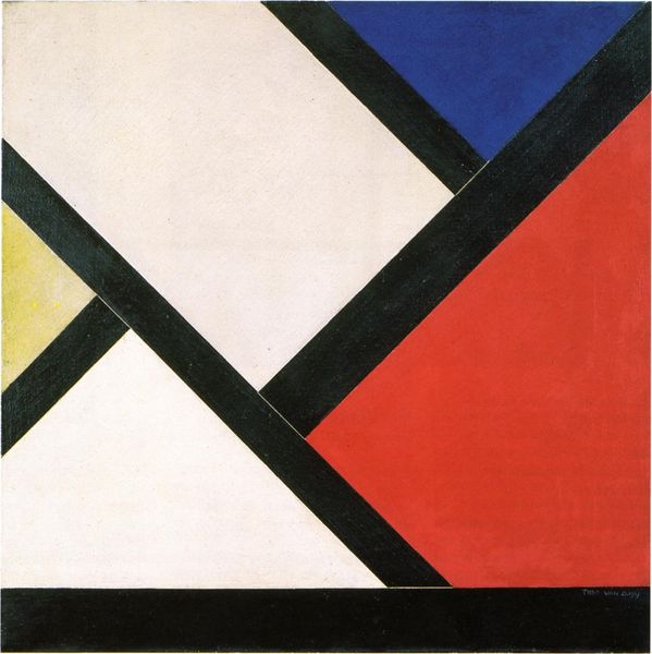
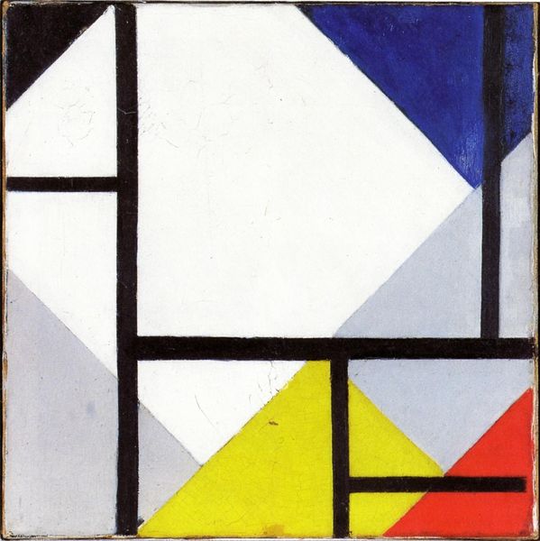
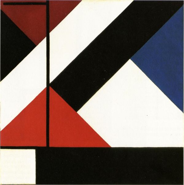
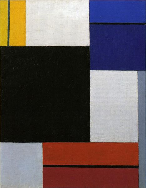
Theo van Doesburg made this ‘Counter Composition V’ sometime in the early 20th Century, using oil paint to push around some very elemental shapes. The process feels almost like a game, doesn't it? The surface has this wonderful, almost mechanical flatness to it; the colors are so direct and clean. It’s easy to imagine Doesburg carefully laying down these shapes one by one, like puzzle pieces, considering how they react to one another, kind of letting the painting build itself. Check out how the red square dominates, but its force is countered by the other shapes in the corners. I find myself particularly drawn to the sliver of white that peeks out near the bottom right – it creates tension, like a hinge between the blue and the red, and sort of makes the whole picture breathe. Doesburg, like Malevich, was trying to get at something primal, a visual language of pure sensation. It's like he's saying, "Here are the basics; now, what can we build?"
Comments
No comments
Be the first to comment and join the conversation on the ultimate creative platform.