Copyright: Rijks Museum: Open Domain
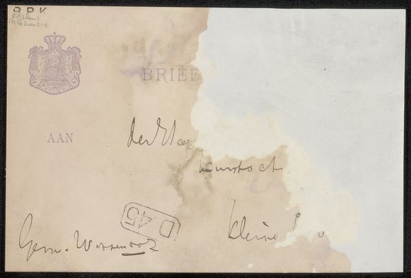
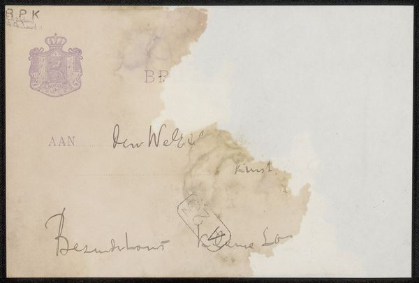
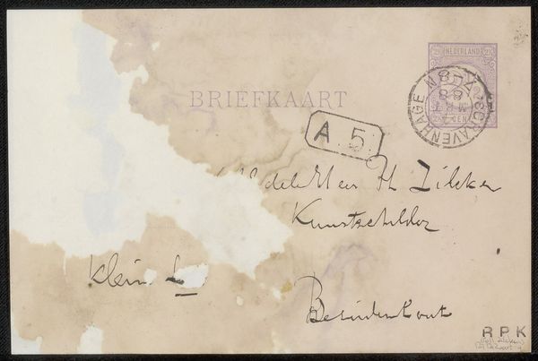
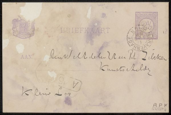
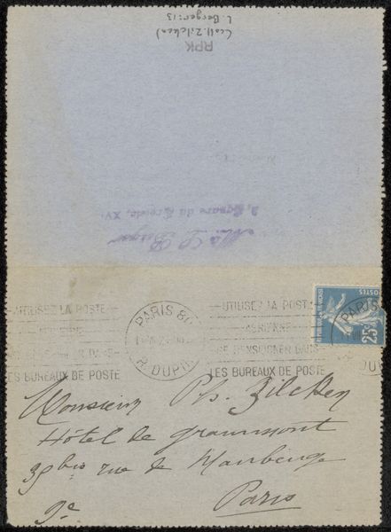
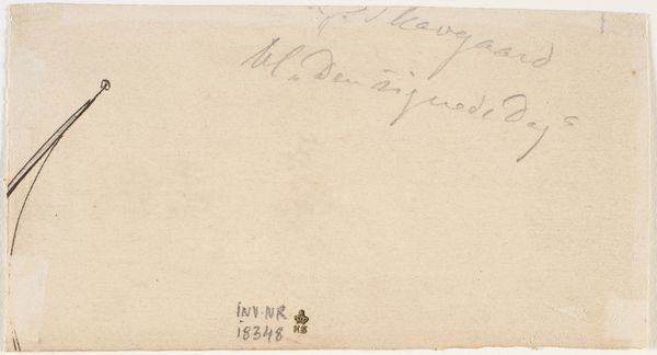
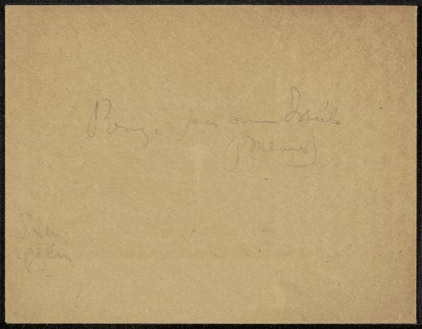
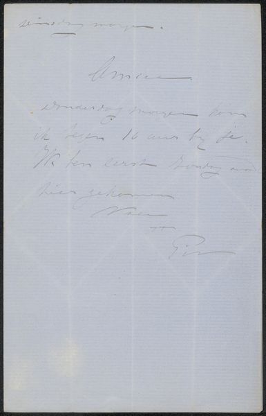
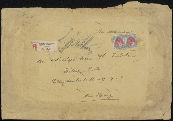
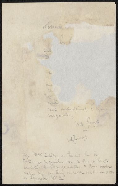
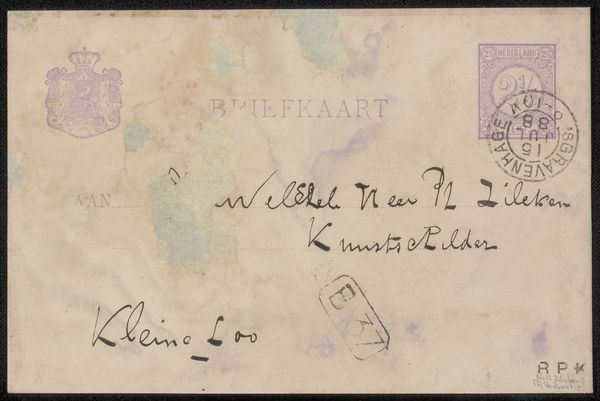
Curator: This ink drawing by Willem de Zwart, titled "Briefkaart aan Philip Zilcken," likely dates between 1872 and 1930. The medium appears to be ink and watercolor on toned paper. It certainly looks worn with age and handling. Editor: It certainly does! Immediately, I see the ravages of time and a hint of preciousness in this humble artifact. The paper’s discoloration speaks of age, yet the remnants of text whisper stories of communication and connection. It evokes melancholy, doesn't it? Curator: It does. As an iconographer, the presence of a formal crest combined with seemingly personal writing immediately grabs my attention. The juxtaposition suggests the merging of formal structures with everyday human exchanges. It indicates societal structures filtering through individual lives, and reminds me how intertwined state power is within our private communications. Editor: Yes, and considering the Post-Impressionistic tendencies apparent here, it could reflect the breakdown of formal traditions themselves. The sketchy, almost unfinished nature of the writing certainly mirrors an immediacy that contrasts with the heraldic imagery, possibly hinting at social changes. The incompleteness offers intimacy. I wonder what Philip Zilcken was supposed to gather from this brief and informal correspondence? Curator: Given that Philip Zilcken was an artist himself, also quite well known for printmaking and drawings, I am tempted to see this “briefkaart” as an exchange between colleagues. It's likely something related to their respective works, or perhaps, the artistic landscape of the period in general. The "BRI" subtly inscribed within the watermark stains might be shorthand for something more, adding another layer to its cryptic message. And given its destination, there is, no doubt, meaning to it. Editor: Perhaps a critique of institutions through its art, an institutional review captured in fleeting commentary… I see layers within layers, suggesting tensions of tradition and progress playing out on a simple card. Its worth lies not just in its visual qualities, but what it tells us about social dynamics, and perhaps even hidden counter-narratives in that historical period. Curator: Exactly. It allows us a peek at what seems to be a personal message which carries within it complex meaning, historical undertones. Editor: And in the stains and fades, time reveals all sorts of new symbols, inviting continuous readings. An enduring message indeed.
Comments
No comments
Be the first to comment and join the conversation on the ultimate creative platform.
More like this