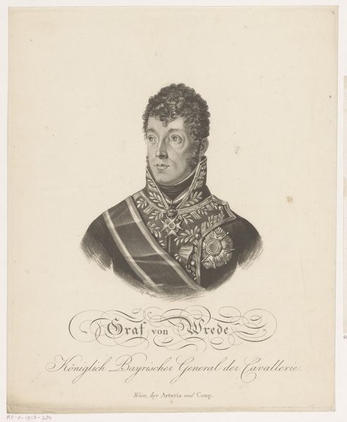
engraving
#
pencil drawn
#
neoclacissism
#
pencil sketch
#
old engraving style
#
pencil drawing
#
history-painting
#
engraving
#
realism
Dimensions: height 308 mm, width 245 mm
Copyright: Rijks Museum: Open Domain
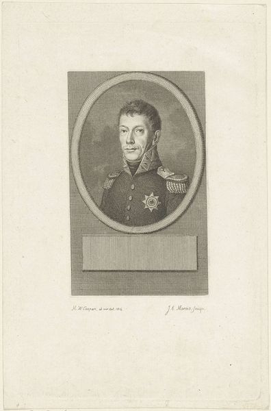
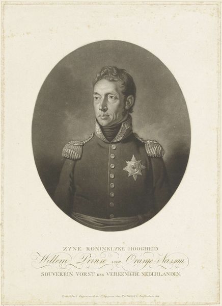
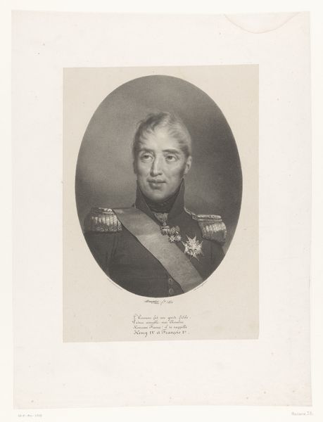
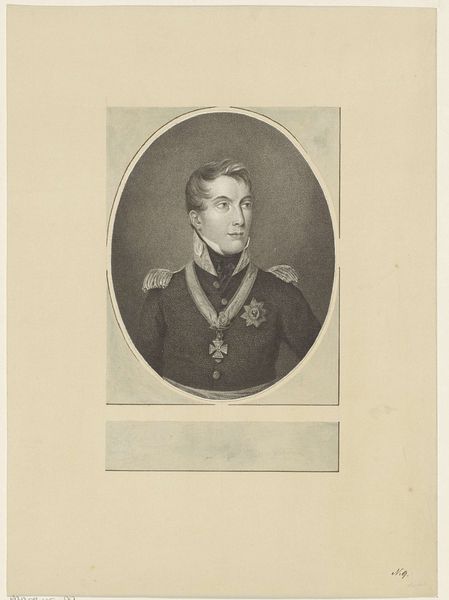
Curator: Allow me to introduce "Portret van Willem I Frederik, koning der Nederlanden," or, Portrait of William I Frederick, King of the Netherlands. This engraving, made sometime between 1815 and 1899 by Martinus van Looyen, depicts the Dutch monarch. Editor: Well, he certainly looks…stern. The monochromatic palette really amplifies the gravity, doesn't it? Almost as if the weight of a kingdom is resting squarely on his rather serious shoulders. It is all so precise, giving the figure and especially his gaze an intense focus. Curator: Indeed. Engravings, with their meticulous lines, often aim for that sense of unwavering authority. William I, after all, was a figure of considerable power and the piece serves as an idealized and lasting visual marker. The oval framing suggests continuity with classic portraiture traditions of royalty, reinforcing that image of leadership. Editor: That's a good point about that frame—it’s sort of sealing him in as this…icon, almost? But there's a funny juxtaposition with the subject's clothing: so opulent and decorated on top, and then just a bare minimum underneath a midriff concealing stripe of fabric. Almost feels at odds, like there is only budget to represent authority from the chest upwards. Curator: Think about what these emblems represented at the time. Consider, for example, the prominent star emblem, that is included alongside epaulettes: visible signifiers of royal order, strength and leadership that reinforced the perception of stability at the dawn of a new Dutch kingdom after the Napoleonic era. Editor: Which begs the question: stability for whom? And at what cost? Looking at the way he is posed, something is telling me that there would likely be limited interest from the subject towards hearing my perspective. But it still speaks loudly: perhaps to an ideal that might not entirely mesh with reality, then or now. Curator: Precisely! Visual communication, especially in portraiture, always involves choices that support a set of beliefs. Van Looyen, as an artist, would have understood that. That is also communicated with that inscription written into the bottom half of the artwork, an extra layer adding depth to the meaning making that sits squarely inside the piece. Editor: Definitely makes you think about the stories these official portraits deliberately leave out, doesn't it? It’s funny how a stiff monarch can open up a whole world of historical reflection! Curator: Indeed. A tiny, somewhat obscured window opens and then suddenly the room has been entirely reconfigured.
Comments
No comments
Be the first to comment and join the conversation on the ultimate creative platform.
More like this