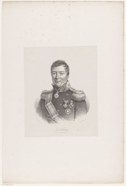
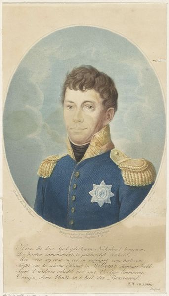
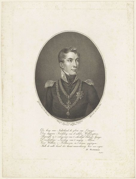
print, engraving
#
portrait
#
neoclacissism
# print
#
old engraving style
#
19th century
#
history-painting
#
engraving
Dimensions: height 246 mm, width 181 mm
Copyright: Rijks Museum: Open Domain
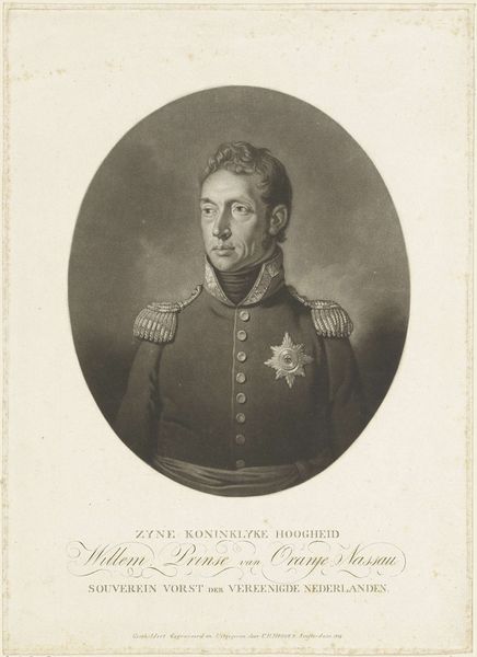
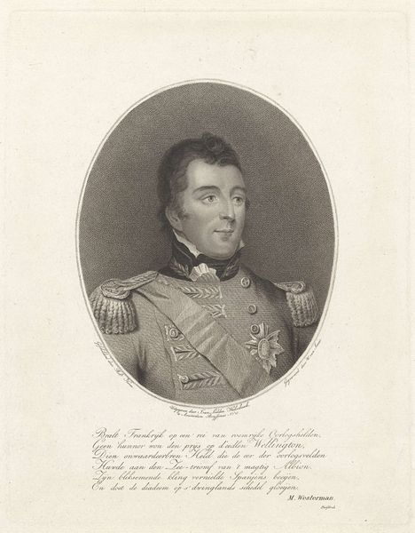
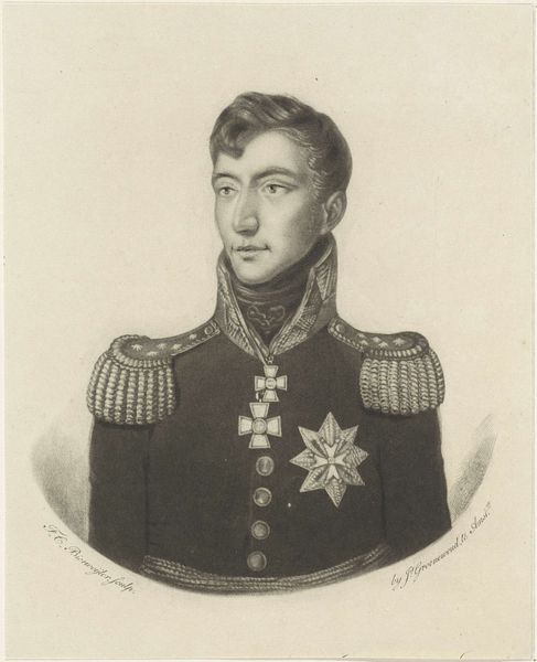
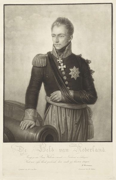
Editor: We're looking at a print titled "Portret van Willem I Frederik, koning der Nederlanden," dating from 1813 to 1819. It's currently held at the Rijksmuseum. It has quite a formal air about it, doesn't it? All those meticulously engraved details in the uniform. What do you see in it? Curator: Precisely, observe how the artist harnesses line and value to construct form, particularly within the king's visage. Note the tightly controlled cross-hatching and stippling used to generate depth. Consider how the oval border contains the composition and focuses attention. How does this rigid structure affect your interpretation of the subject? Editor: It definitely makes him seem...authoritative. Unapproachable, almost. I guess it’s designed to convey power, right? But is there something else to this formalist approach? Curator: The emphasis on linearity, clarity, and order aligns neatly with Neoclassical principles. The precise delineation of details, eschewing painterly looseness, evokes a sense of rationality. This pursuit of ideal form suppresses the immediacy of expressive gestures, contributing to a dignified but somewhat detached portrayal. How does the absence of color impact your understanding? Editor: Good question. It lends the work an austere feel. The lack of colour really does put emphasis on form and the tones are what carry the message. Without it, we're really left with pure representation. It forces you to appreciate the line work. Thank you, I learned a lot. Curator: Indeed, it underlines the graphic structure and underscores the composition’s intrinsic properties. The careful examination of form reveals intended, but not always obvious aspects of the artwork.
Comments
No comments
Be the first to comment and join the conversation on the ultimate creative platform.
More like this