#
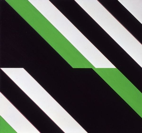
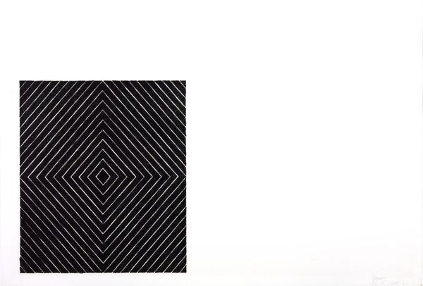
op-art
#
op art
#
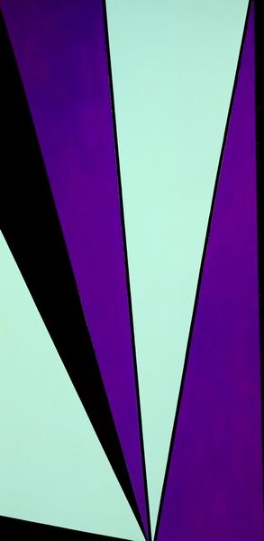
geometric
#
geometric-abstraction
#
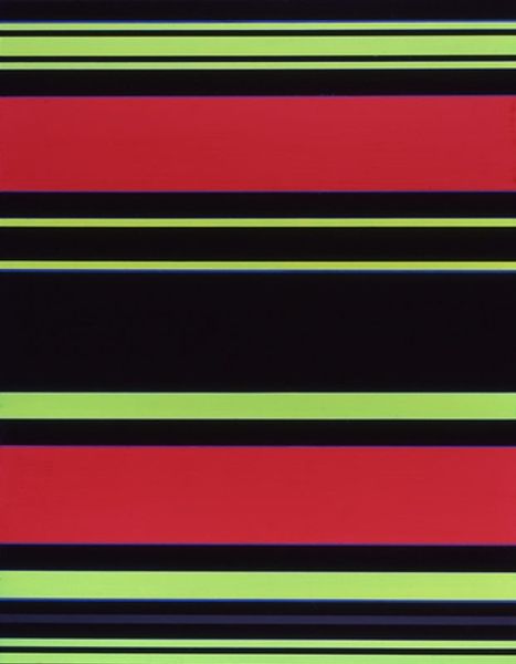
line
#
monochrome
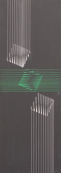
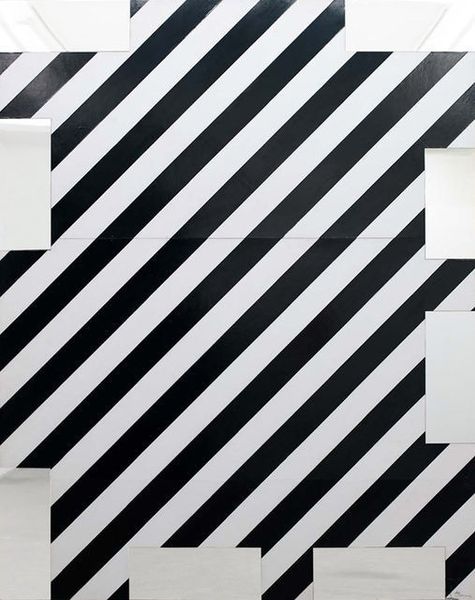
Copyright: Gunter Fruhtrunk,Fair Use
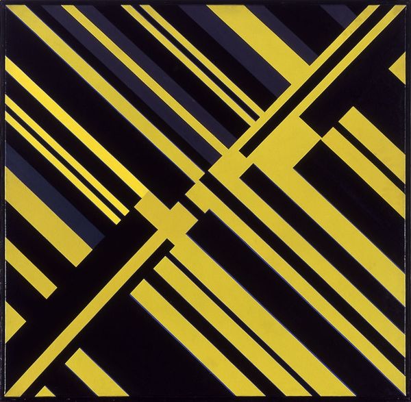
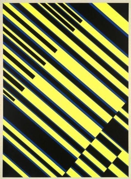
Curator: Let's turn our attention to "Skansion" from 1972, created by Günter Fruhtrunk. At first sight, it seems so simple: stripes, just black and white. Editor: My immediate thought is static electricity—those lines seem charged, almost ready to leap from the canvas. There’s a tension, isn't there, in the contrast? But it makes me wonder about the cost and origin of black and white paint during that time period, because it could influence artist choices. Curator: You've honed in on that tension. Fruhtrunk was really working with Op Art principles here, trying to trick the eye, to create a sense of movement on a flat surface. It is quite architectural; the use of bold lines and stark contrast gives me the sense of ascending towers and buildings, although arranged abstractly. Editor: Absolutely. And considering the post-war era, the materials themselves become significant. Were they industrial byproducts, surplus goods transformed? And to push that, how did Fruhtrunk's choices relate to labor? The repetitive, precise lines suggest both meticulous craftsmanship and a potentially alienating process. How might an assistant's hand have shaped the final product? Curator: That’s fascinating, the labor involved. I'm thinking also about how reductive it is—paring painting down to pure form and line. It feels almost rebellious in its stark simplicity, a kind of refusal of narrative or sentiment. Imagine him stripping away everything unnecessary, to find the core visual impact! Editor: Right, and that "core visual impact" lands very differently depending on your socio-economic background. What materials are readily available in different regions? Even the "simple" choice of black and white can be read as an act loaded with political and social connotations. Black and white don’t have equal access, which informs both production and consumption in important ways. Curator: It's a powerful reminder that even seemingly neutral aesthetic choices are embedded within a larger framework. "Skansion" really prompts us to look beneath the surface and to feel the vibrations that exist between materials and form. Editor: Exactly. I'll be thinking about those charged lines and how accessible they really were, materially and ideologically, as I move along to the next work.
Comments
No comments
Be the first to comment and join the conversation on the ultimate creative platform.
More like this