Copyright: Gunter Fruhtrunk,Fair Use
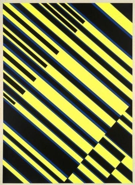
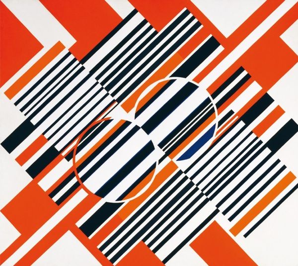
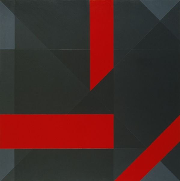
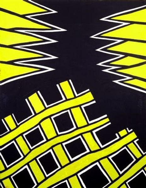
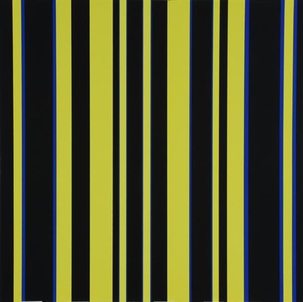
Curator: Gunter Fruhtrunk's "Untitled" from 1967, rendered in acrylic paint, offers a striking example of Op Art from the period. Editor: It definitely hits you right away with that bold contrast! The sharp yellow lines slicing through the dark ground… it feels almost confrontational. Like a warning sign. Curator: That starkness is quite intentional. Fruhtrunk, associated with German Expressionism, was deeply interested in the visual language of postwar reconstruction and societal shifts. Editor: So the geometry isn't just decorative? How do the composition's visual components shape this reading? Curator: Exactly. The arrangement avoids any central focus; these lines crisscross without resolution, speaking to the destabilization of established orders in the wake of conflict. Its hard-edge painting reduces depth of space while bringing it out. It reflects society. Editor: I can see that. There’s something very... calculated about how these dynamic stripes lock the viewers' attention, but ultimately go nowhere, almost dizzying in effect. Curator: And while visually striking, "Untitled" maintains a strong dialogue with the Bauhaus movement’s emphasis on rationality and function in art. These stripes might reference the reconstruction boom while also questioning it through abstraction. Editor: Do you think Fruhtrunk succeeds? Curator: It’s complex. The immediate visual punch creates an emotional response, almost against your will, which might also criticize the rapid, unconsidered developments of the era. He provides depth with his manipulation of colours. Editor: Interesting how a seemingly simple pattern can hold so many layers of meaning. I’ll never look at a straight line the same way again. Curator: Hopefully this has provided fresh perspectives. Fruhtrunk's paintings show us art is as reflective of social movements as any news broadcast.
Comments
No comments
Be the first to comment and join the conversation on the ultimate creative platform.
