#
pencil drawn
#
toned paper
#
light pencil work
#
pencil sketch
#
charcoal drawing
#
charcoal art
#
portrait reference
#
pencil drawing
#
portrait drawing
#
pencil work
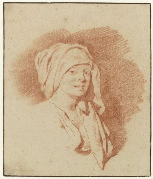
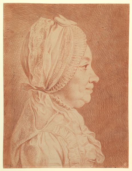
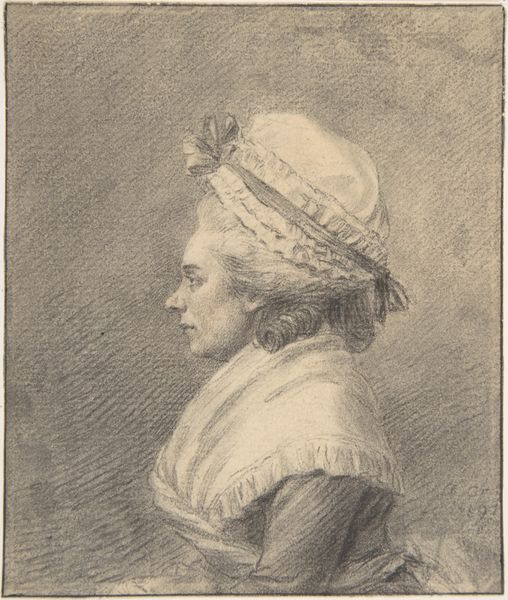
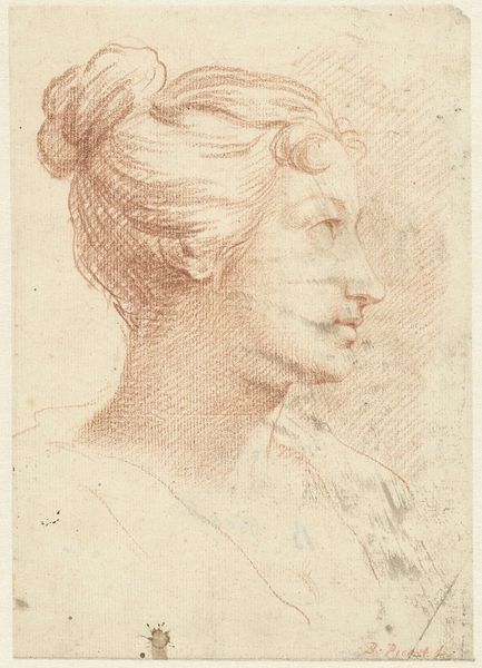
Dimensions: height 65 mm, width 61 mm
Copyright: Rijks Museum: Open Domain
Editor: We're looking at "Buste van een vrouw met brede hoed," or "Bust of a Woman with a Wide Hat," a pencil drawing on toned paper by Aert Schouman, made sometime between 1720 and 1792. It’s at the Rijksmuseum. I’m immediately drawn to the softness of the lines; the shading almost feels like mist. What compositional elements stand out to you? Curator: Indeed. The subtlety is key. Notice how the artist utilizes the toned paper itself as a middle ground. The pencil work doesn’t create forms so much as it *reveals* them. It's almost as if Schouman is subtracting from the darkness, coaxing the form into existence through careful gradations of light. How do you feel about the placement of the head and hat? Editor: It’s interesting! The hat seems almost too large, dominating the composition and obscuring the woman's face. It directs my eyes right towards her face and serene expression. Curator: Precisely! It's an astute manipulation of scale and proportion. While the hat's size might initially strike one as disproportionate, its strategic placement generates a dynamic tension within the pictorial space. Consider how the shadow cast by the brim interacts with the facial features. Is the contrast created accidental or purposeful? Editor: I would definitely say purposeful. The contrast really shapes the face, giving her structure and highlighting that delicate expression. I'm curious about why he chose such a muted palette. What is the impact of his choices on the viewing experience? Curator: The near-monochromatic palette concentrates our attention on the subtle modulations of tone and texture. The drawing calls attention to the elegance of form. Without the distraction of color, we are left to consider the interplay of light and shadow, the delicate balance of line and mass, and the expressive potential of a minimalist aesthetic. A careful study of the marks allows us to see how he achieves the interplay you noticed. Editor: I see what you mean; focusing on structure highlights Schouman’s skill! It really draws me in. Curator: Absolutely. Analyzing art's structure reveals the artist’s choices. Hopefully it enables the viewer to consider those intentions. Editor: I agree. Focusing on the composition highlights Schouman's intention, and the impact on us.
Comments
No comments
Be the first to comment and join the conversation on the ultimate creative platform.
More like this