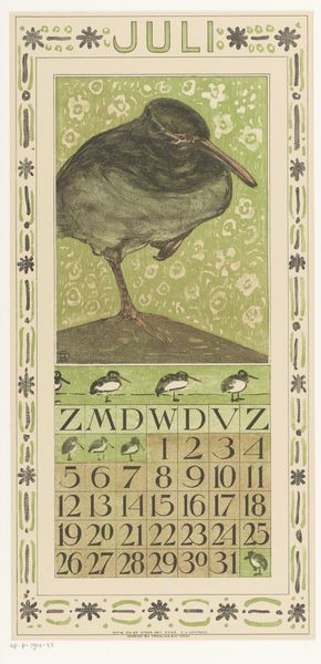
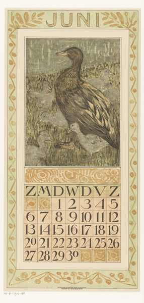
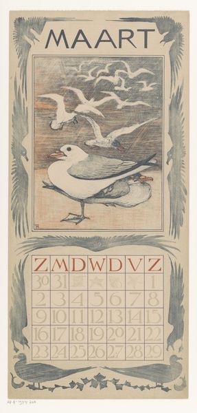
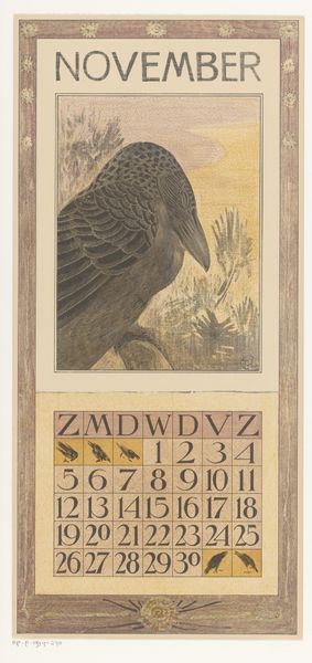
print, woodcut
#
art-nouveau
# print
#
woodcut effect
#
landscape
#
figuration
#
woodcut
Dimensions: height 440 mm, width 210 mm
Copyright: Rijks Museum: Open Domain
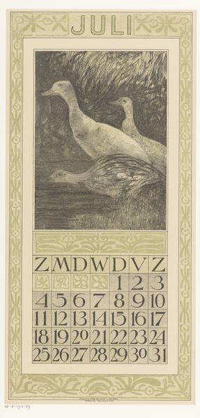
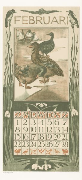
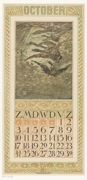
This calendar page, made by Theo van Hoytema, probably using lithography, really catches my eye with its grayscale that feels like a quiet whisper. Look at the way the marks build up to define those ducks gliding through the water. It’s not about being slick or photorealistic; it’s about the pleasure of the process, the artist feeling his way through the image. I can almost see him making each mark, layering the tones to suggest the weight and texture of feathers. The waterlilies add a touch of stillness. The texture isn’t just visual; you can almost feel the cool water, the soft feathers. There's a dialogue between the hard edges of the calendar grid and the soft, blurred edges of the water and ducks. This piece reminds me a little of some of the early 20th century printmakers, like Félix Vallotton, in the way it finds a delicate balance between observation and graphic sensibility.
Comments
No comments
Be the first to comment and join the conversation on the ultimate creative platform.
More like this