graphic-art, lithograph, print
#
graphic-art
#
art-nouveau
#
animal
#
lithograph
# print
#
landscape
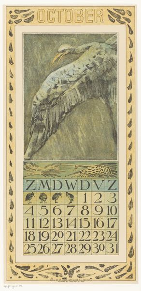
Dimensions: height 440 mm, width 210 mm
Copyright: Rijks Museum: Open Domain
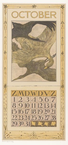
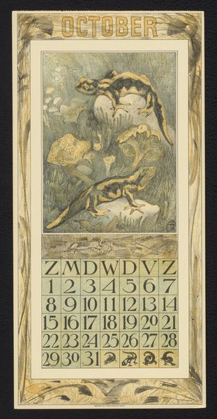
Theo van Hoytema made this calendar page for October with lithography, and it’s like a snapshot of autumn in flat shades of muted green and brown. Look at how the ducks dive and swoop. The artist isn't trying to give us a perfect picture. It’s more about feeling the motion, the energy of the birds against the water. Those lines look as though they were made very quickly, and that looseness brings the whole scene to life. There’s a real handmade quality in the borders with their bold shapes. Then you have the calendar grid with its clean, uniform type. It’s a reminder that art lives side by side with everyday life, blurring the lines between the practical and the beautiful. It makes me think of Walter Crane, who also designed amazing calendars. I love art that’s not afraid to be useful and a bit strange at the same time.
Comments
No comments
Be the first to comment and join the conversation on the ultimate creative platform.
More like this