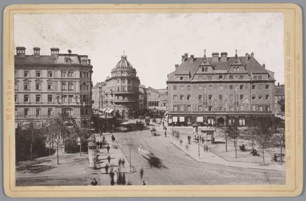
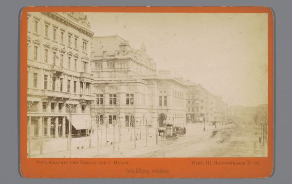
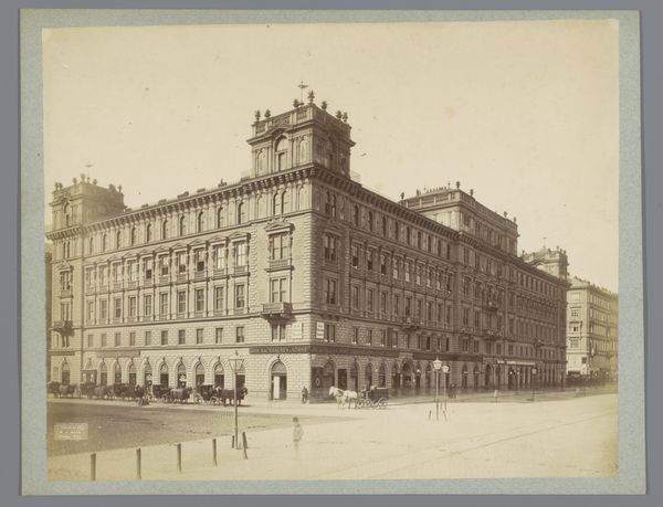
print, photography, architecture
#
portrait
#
historical design
# print
#
historic architecture
#
traditional architecture
#
photography
#
cityscape
#
architecture
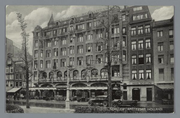
Dimensions: height 89 mm, width 138 mm
Copyright: Rijks Museum: Open Domain
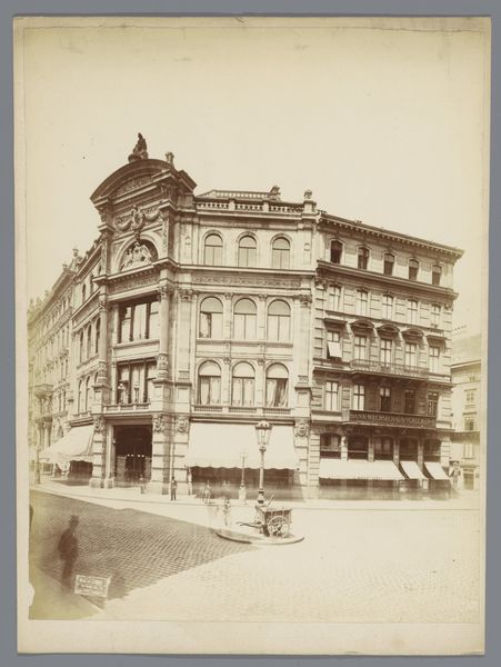
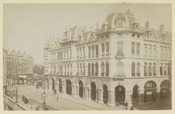
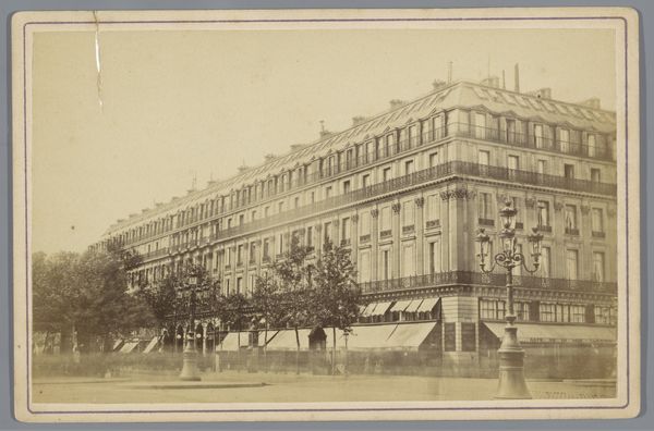
Curator: Ah, a slice of old Amsterdam. Here we have a print titled "Hotel 'Schiller' - Amsterdam (Holland)," likely captured sometime between 1915 and 1930 by S. Sealtiel. It presents the Hotel Schiller, a handsome piece of architecture. Editor: There’s a distinct sense of layered time here. The grand facade of the Hotel, coupled with the slightly blurred monochrome aesthetic gives a cinematic quality to the historical photograph. Curator: Exactly! Notice the interplay of vertical and horizontal lines – the rows of windows, the overhanging canopies of the cafes spilling onto the sidewalk. There is almost an industrial, yet traditional design language on display, one which feels very true to Amsterdam, which can be very linear at times. The composition leads your eye upward, emphasizing the hotel's height. It appears both grand and inviting. Editor: Yes, I can also feel a slightly rigid pattern emerging from this piece. Let's examine the repeating window motif and the way signage dominates the architecture— "Hotel Cafe Restaurant" screaming out across the frontage in a series of parallel messages and languages. It's semiotic overload, like walking into a thought. The almost excessive level of information adds a different sort of dimension. Curator: That density speaks volumes about early 20th-century urban life, doesn't it? And there is an incredible layering in it, with some soft natural curves offered by a sparse collection of trees dotted in front of the building and a light traffic moving past to create the full composition of an early Amsterdam cityscape. What is quite intriguing is to imagine what sorts of activity or what sort of people were living in that space. Editor: The subdued color palette only serves to deepen the sense of time having settled. Almost every shade on show feels subdued and faded, despite having been intentionally laid, which only really enriches the overall narrative. I feel an intimate familiarity with that sort of visual construction. The narrative feels more timeless because of the tone. Curator: Absolutely. A really stunning captured memory frozen within monochrome and offering a brief snapshot of Dutch daily life at that time! Editor: A fascinating, complex portrait—it leaves me pondering the many invisible lives passing through that space throughout the day!
Comments
No comments
Be the first to comment and join the conversation on the ultimate creative platform.
More like this