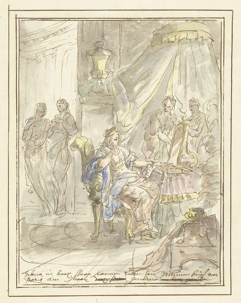
drawing, watercolor, ink
#
portrait
#
drawing
#
comic strip sketch
#
aged paper
#
toned paper
#
baroque
#
pencil sketch
#
sketch book
#
figuration
#
personal sketchbook
#
watercolor
#
ink
#
sketchwork
#
sketchbook drawing
#
history-painting
#
storyboard and sketchbook work
#
sketchbook art
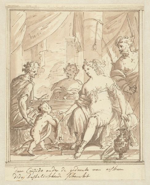
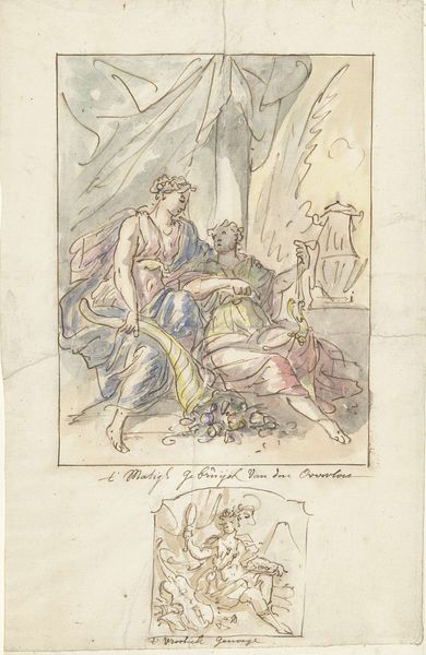
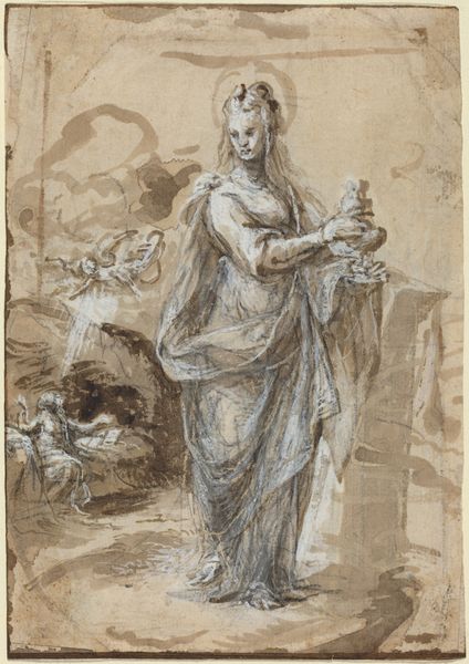
Dimensions: height 253 mm, width 180 mm
Copyright: Rijks Museum: Open Domain
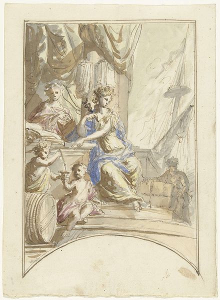
Editor: Here we have "Cleopatra" by Elias van Nijmegen, made sometime between 1677 and 1755 using ink and watercolor. I'm immediately struck by the composition – the way she’s positioned on what looks like a chaise lounge, almost as if on a stage. What aspects of its formal qualities stand out to you? Curator: The most compelling feature is, arguably, the manipulation of light and shadow, achieved through delicate watercolor washes and precise ink linework. Note how Nijmegen renders volume not with gradual shading, but with strategic hatching and cross-hatching. Do you see how this technique contributes to the overall texture of the work? Editor: I do. It's like the lines themselves are creating the form. The use of line also seems to separate different blocks of color, or the blocks aren't pure enough on their own. Why is the color so ashy? Curator: The restrained palette contributes to the drawing's somber and introspective mood. The limited tonal range directs the eye toward the central figure of Cleopatra and accentuates the inherent drama of the subject. How does the figure's posture contribute to the drawing's overall impact? Editor: She appears both regal and defeated, the slump in her shoulders speaks volumes. But, wouldn’t a richer palette enhance the opulence typically associated with Cleopatra? Curator: Possibly, but Nijmegen’s deliberate choice may reflect a concern with inner emotion over superficial grandeur. Note the calculated placement of the figure within the pictorial space. Do you observe any relationship between the placement of figures and emotional state? Editor: I see the servant attending to Cleopatra, almost mirroring her weariness through their bowed head and slumped stance as they both sink into despair and isolation. Studying Nijmegen’s line and color choices reveals much about his intentions. Curator: Indeed, our focus on these intrinsic elements yields a deeper appreciation for the artwork.
Comments
No comments
Be the first to comment and join the conversation on the ultimate creative platform.
More like this