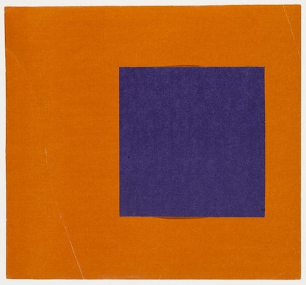
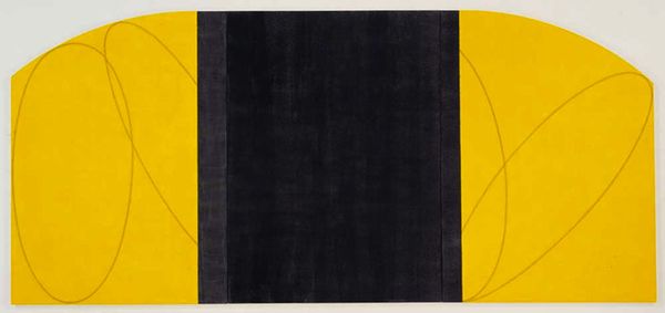
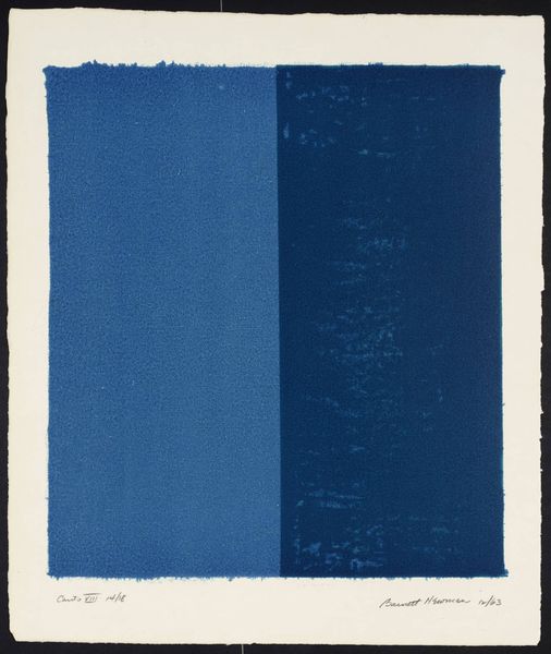
painting
#
abstract-expressionism
#
painting
#
colour-field-painting
#
geometric
#
abstraction
#
modernism
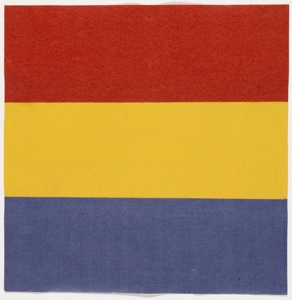
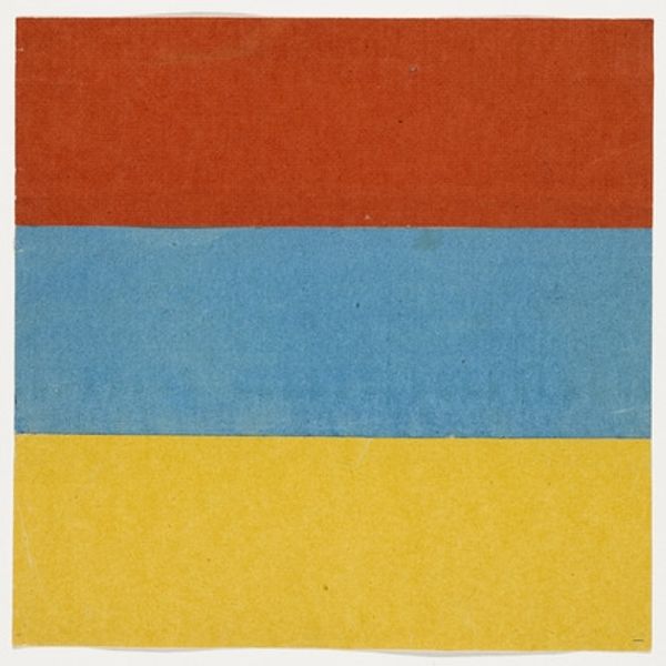
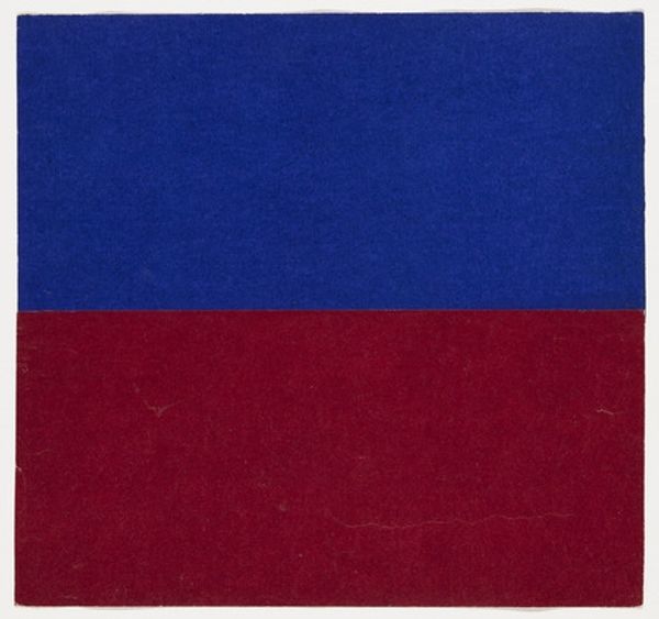
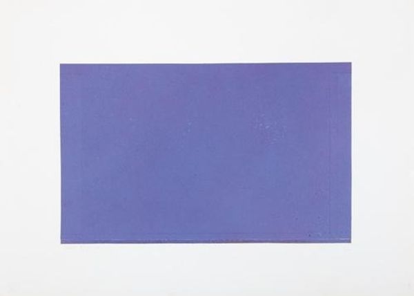
Copyright: (c) Ellsworth Kelly, all rights reserved
Editor: Here we have Ellsworth Kelly’s “Yellow and Blue,” painted in 1951. At first glance, it's strikingly simple—two blocks of color, one stacked on top of the other. The blue feels deep and grounded, while the yellow seems to float. I find myself drawn to its serene, almost meditative quality. What strikes you most about this painting? Curator: Ah, yes, Kelly. Serene, but don’t let the simplicity fool you. It’s less about *what* you see, and more about *how* you see. Look closely. Consider: is that division a clear boundary? How does the meeting of those colours vibrate? To me, it's an exploration of pure form and colour relationships. Think about what yellow *does* next to blue...it vibrates in a totally different way to, say, yellow on red. Does this color interaction stir an emotion within you, a memory? It's a deeply personal and intuitive experience. Editor: That’s interesting – I hadn't considered the interaction that deeply. It does feel different from seeing, say, red and yellow together; there is a certain cool to this painting. Almost a separation, perhaps a tension, even. Do you think he was striving for that specific reaction? Curator: Maybe "striving" is too strong. Kelly wasn’t after direct representation or obvious symbolism. For me, it’s an invitation to quiet the mind, feel the colours and question how colours behave in their environment. There’s a touch of the alchemist, or perhaps, a bit of the rebel in the exploration, don’t you think? Editor: Absolutely! Seeing it as an invitation rather than a statement really shifts my perspective. Curator: Mine too! Now I can’t help but to imagine the piece humming with secret code!
Comments
No comments
Be the first to comment and join the conversation on the ultimate creative platform.
More like this