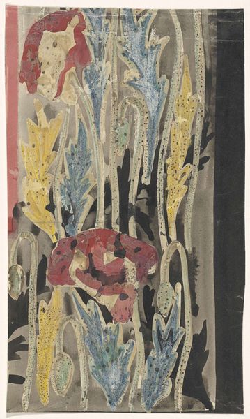
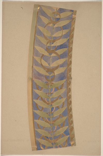
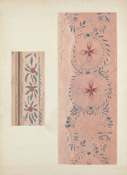
Ontwerp met papavers voor de rand van het wandtapijt Gezicht op Florence 1925 - 1926
0:00
0:00
careladolphlioncachet
Rijksmuseum
painting, watercolor
#
organic
#
painting
#
watercolor
Dimensions: height 315 mm, width 113 mm
Copyright: Rijks Museum: Open Domain
Curator: Immediately striking! The poppy seems to drip onto the muted background. It has a fascinating, somewhat melancholic quality. Editor: That's interesting. What you're viewing is Carel Adolph Lion Cachet's watercolor design created around 1925, entitled “Design with Poppies for the Edge of the Tapestry View of Florence,” which resides here at the Rijksmuseum. As the name suggests, it was intended for a tapestry border, explaining its narrow, vertical format. Curator: I can see that now, intended as part of something grander. The rendering of the poppy itself feels quite modern though. Almost abstract in its looseness, compared to the art nouveau styling of the stems. I like how the watercolor bleeds. It gives it an ephemeral feel, like a fleeting moment in nature. Editor: The organic theme connects deeply with the Art Nouveau style, visible not only in the subject matter but also in the fluid, curvilinear lines that define the stems. These forms, popular during the era, frequently signified growth, vitality, and the inherent beauty of the natural world. Yet, what I find curious, is Lion Cachet using watercolor instead of dyes to explore pattern and decoration, given the textile applications. Curator: Possibly experimenting, testing the design's impact. And perhaps the blurring aids the sense of depth, creating visual layers with the darker silhouettes in the background. Although initially purposed for mass reproduction via tapestry, the current watercolor form brings this particular piece into sharp focus as one driven more by impressionistic sentimentality rather than strictly commercial imperatives. Editor: I see your point. It speaks to the complexities inherent in artistic production. The poppies also carry diverse cultural meanings. Associated with sleep and death because of their opium content, but also remembrance as they famously bloomed in Flanders Fields in World War I. How might this context affect its interpretation as part of a View of Florence? Curator: Perhaps hinting at the ephemerality of beauty, even within enduring cities. Makes the viewer think about nature’s consistent growth regardless of our presence, right? The design does possess a quiet contemplation that feels removed from commercialism; it presents nature and a subtle sociopolitical stance. Editor: A really interesting duality we can pull from just a border! Thank you, this was illuminating. Curator: The pleasure was mine, offering me an alternate perspective.
Comments
No comments
Be the first to comment and join the conversation on the ultimate creative platform.
More like this