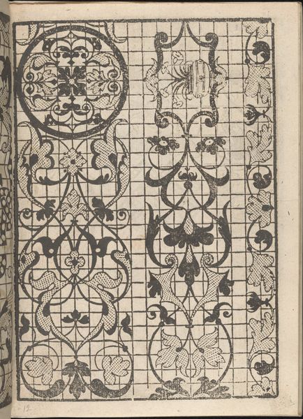
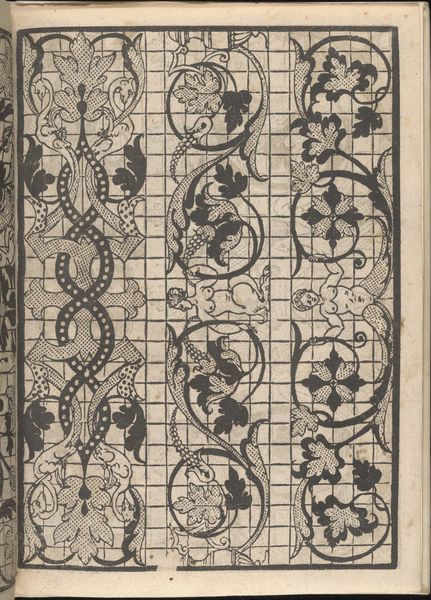
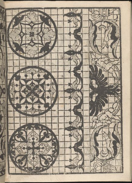
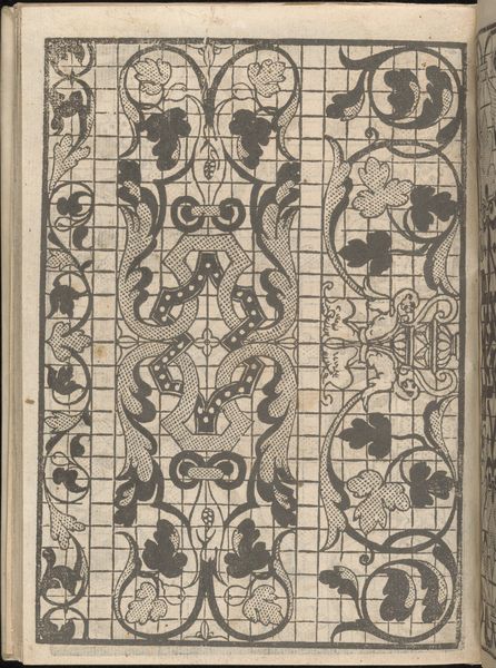
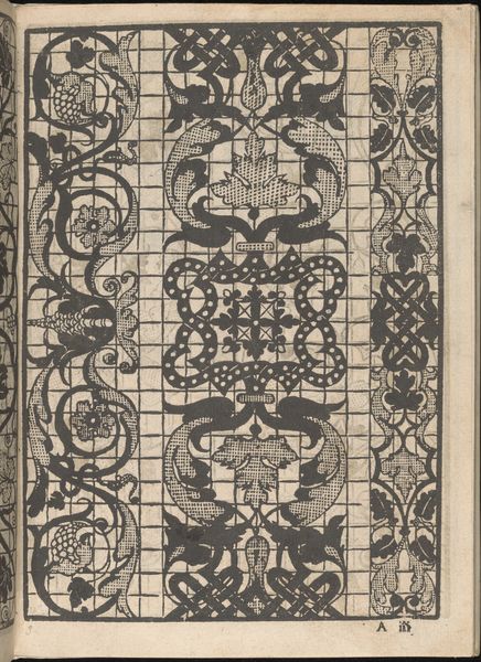
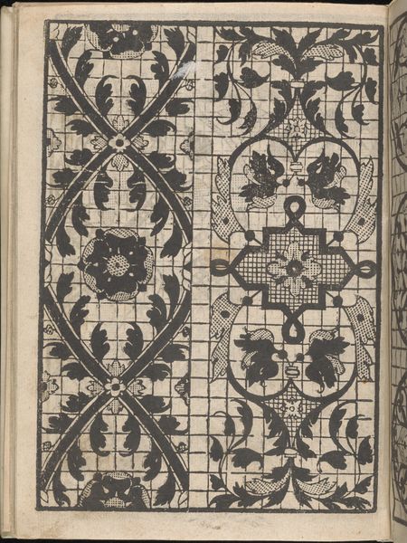
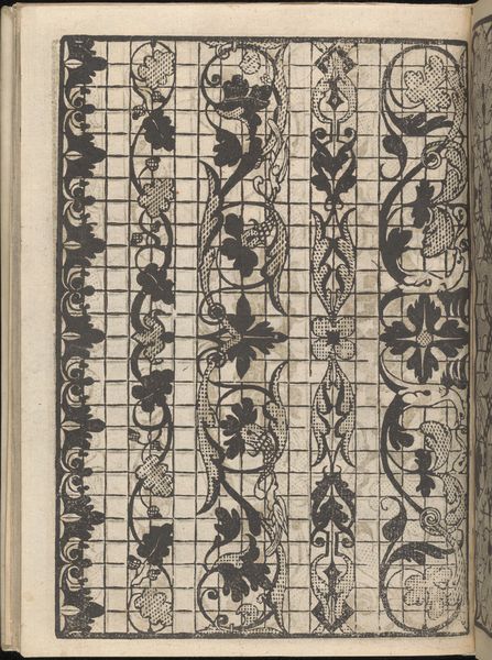
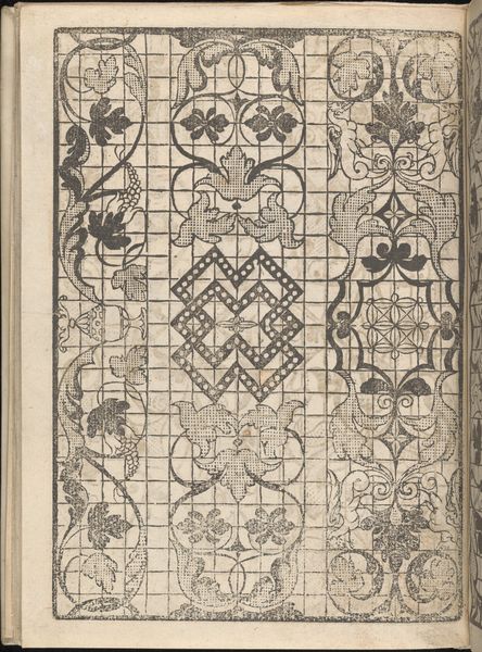
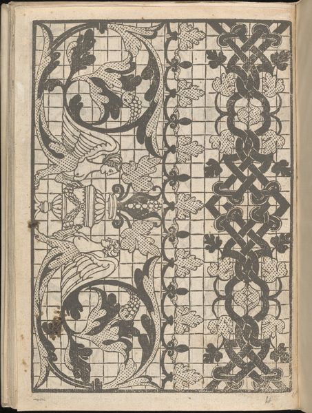
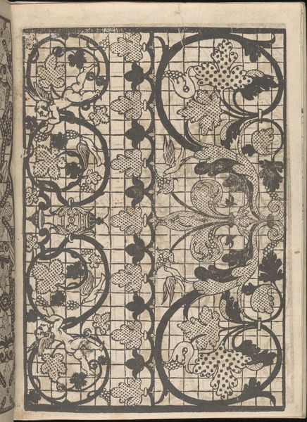
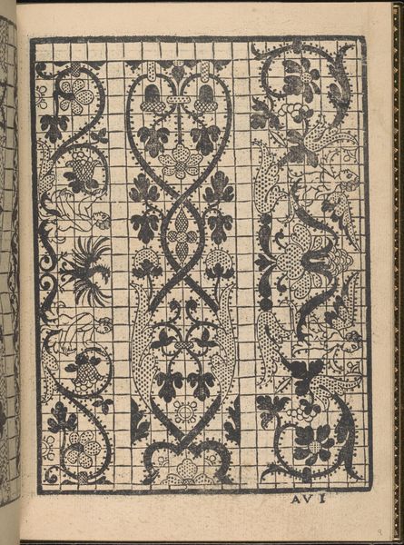
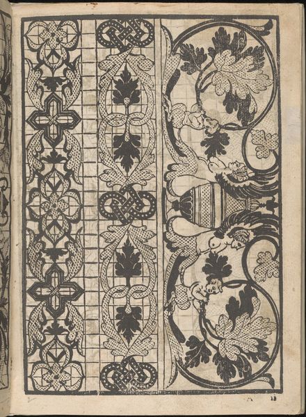
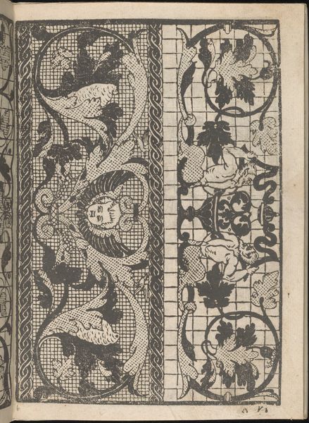
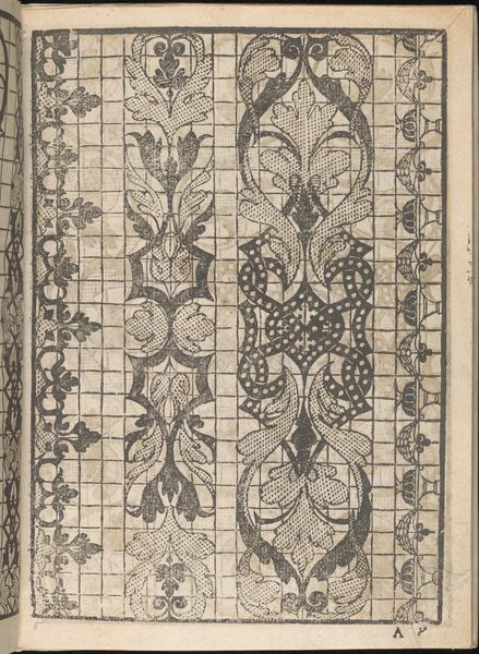
Splendore delle virtuose giovani, page 8 (recto) 1564
0:00
0:00
drawing, graphic-art, print, ink, engraving
#
drawing
#
graphic-art
#
pen drawing
# print
#
11_renaissance
#
ink
#
engraving
Dimensions: Overall: 7 1/2 x 5 1/2 in. (19 x 14 cm)
Copyright: Public Domain
Curator: Immediately, I see the careful grid and a fascinating density of shapes and contrasts. I am immediately intrigued. Editor: I'm here with you, admiring “Splendore delle virtuose giovani, page 8 (recto),” created by Iseppo Foresto in 1564. It's a page showcasing a design with ink and engraving on paper, housed here at The Met. I’d be very interested to find out a bit more, given your feelings towards it, too. Curator: Well, there’s something powerful about the almost clinical grid battling it out with these free-flowing, ornate shapes. To me it mirrors the push and pull between order and the untamed imagination that any young, bright woman must have felt then. A battle between society and her desires! Editor: Exactly. You know, pattern books such as this served a distinct purpose. The title literally translates to “Splendor of Virtuous Young Women” suggesting a design source tailored to an upper-class female audience perhaps embroidering or involved in other decorative art forms. Curator: That explains so much. There’s a strange tension that suddenly feels less aggressive and more aspirational, more decorative. Like the dream of flight as opposed to fighting for survival, the image of the bird suddenly evokes a lightness of touch. And you're saying the virtous young women of the time used this design as a direct source for patterns! It is an image of controlled liberty. Editor: Absolutely. Consider the recurring motif of leaves and intertwined lines. These motifs held multiple meanings throughout history and in Renaissance art are typically connected to notions of growth, creativity, and eternity. The page contains a reservoir of symbols designed to not only inspire aesthetically, but also convey a sense of lasting elegance. Curator: I love that. In a funny way it also becomes this coded language of femininity. Perhaps it helped those creating to speak about womanhood in subtle terms beyond mere prettiness. Editor: That is very possible. And I can appreciate the artistry behind each line, even down to the finest stroke of ink used. There’s a clear respect that they give to the history of design and to those who might then translate them on other items of beauty. Curator: Yes. This design speaks about aspiration and hope, the very things any woman needs to thrive! And looking back on this page of ‘Splendore,’ perhaps, we can also rediscover their brilliance!
Comments
No comments
Be the first to comment and join the conversation on the ultimate creative platform.
More like this