paper, ink
#
medieval
#
asian-art
#
paper
#
ink
#
islamic-art
#
calligraphy
Dimensions: 25.3 × 17.7 cm (9 15/16 × 6 15/16 in.)
Copyright: Public Domain
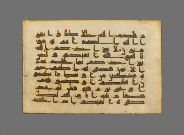
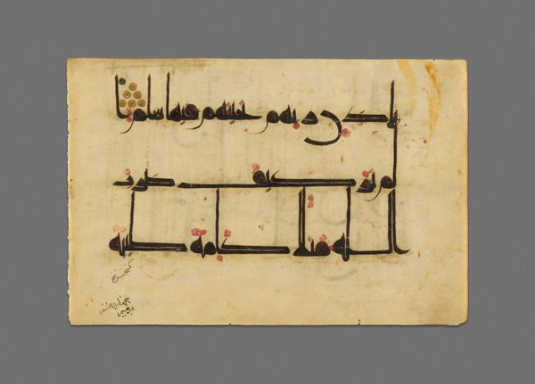
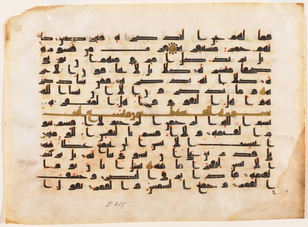
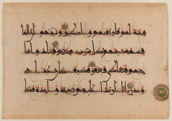
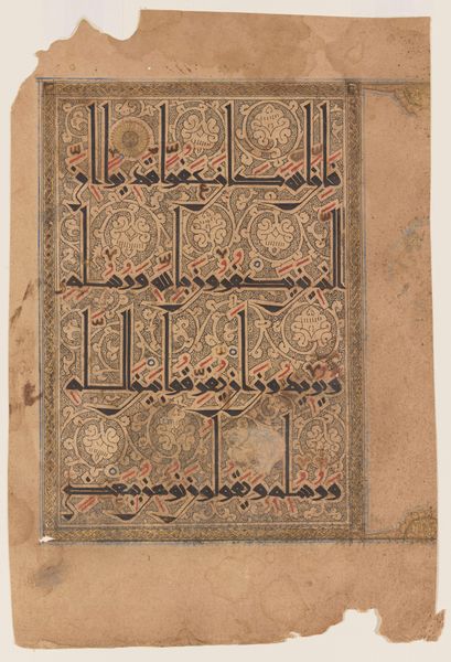
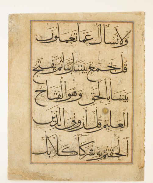
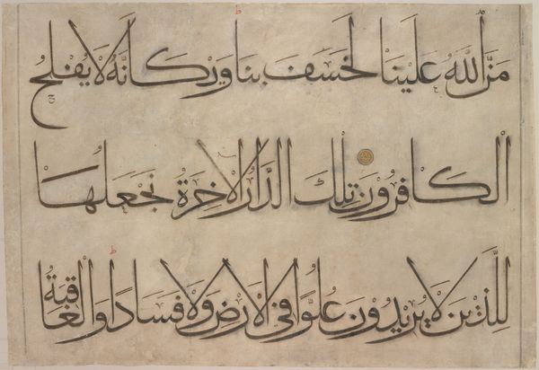
Editor: Here we have a page from a Qur'an manuscript, created around the 11th or 12th century. It’s made with ink on paper. The elegant calligraphy gives it a peaceful yet commanding presence. How do you interpret this work from a formal perspective? Curator: What strikes me immediately is the deliberate arrangement of the script. Observe how the horizontal lines dominate, creating a sense of stability. These are punctuated by the vertical strokes that add a rhythmic element. The spacing between the lines and words isn't just functional; it's a crucial element in the overall visual composition, creating a balanced positive and negative space. Editor: The red and blue dots and small flourishes are also interesting! What is the purpose behind these design choices? Curator: Precisely! Consider the carefully placed diacritics and vowel markings in red and blue. Functionally, they aid in pronunciation. However, visually, they inject dynamism into the otherwise uniform black script. It also prevents monotony on the page and draws your eyes across it. The circular gold and ornate ornament serve as markers, yet also function as visual anchors that contain and balance the piece. Editor: I see, so the added colors give an overall sense of flow. Does the specific style of script impact your view? Curator: Absolutely. Though I couldn't tell you specifically which passage this shows, consider the evolution and standardization of Kufic script as crucial to the early spread of the Qur'an, not just religiously but artistically. Notice the bold angularity; the thickness variation communicates stability, and power. Do you notice how those letterforms contrast and play off of each other to make for such a distinctive visual experience? Editor: Yes, it does, very powerful! I never considered the weight of each word’s construction. I am also appreciating the power and grace of such disciplined, geometric forms of script. Curator: Exactly! Understanding the interplay between text and design invites deeper appreciation of this manuscript, enriching our viewing experience by making us aware of all the careful and complex details within it.
Comments
No comments
Be the first to comment and join the conversation on the ultimate creative platform.
More like this