print, woodcut
medieval
narrative-art
figuration
woodcut
Copyright: National Gallery of Art: CC0 1.0
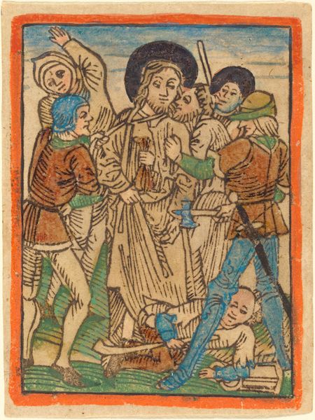
Editor: Here we have "Saint Erasmus," a woodcut print from around 1470 to 1480. It's quite graphic and unsettling, the composition so direct. What elements of visual language stand out to you in this piece? Curator: The strong lines immediately strike the viewer, delineating form with an unflinching commitment. Note how the texture, achieved through the woodcut medium, creates a rich surface, contrasting areas of dense hatching with the relatively smooth planes of the figures' faces. It almost accentuates the brutal nature of the act depicted. Editor: So, the texture emphasizes the subject? It does look very physical. Curator: Indeed. Consider the architectural framing device, which while offering a setting, primarily serves to contain and focus the eye on the central action. What purpose does the contrast between this highly organized and contained central tableau and the surrounding architectural and background planes suggest to you? Editor: The clear lines almost flatten the space, which forces you to really focus on the figures and what's happening to them. There’s also the almost decorative quality in the lines around the arch at the top and the patterning of the floor, almost obscuring the real horrors going on? Curator: Precisely! The horror is framed, made aesthetically consumable, if you will. Does this create tension, and if so, how does the visual system emphasize such oppositions? Editor: Definitely a tension between the violence and what almost becomes a design. It makes me consider what the artist might have intended – whether it was devotional or perhaps even critical. Curator: Your insights are keen! Notice that there appears to be no single or dominant focal point for your eye to fix on to navigate the tableau; instead the horror vacui quality that permeates this composition seems geared to forcing you to attend to the various visual and expressive details as aspects of a whole visual/expressive system of inter-relationships. Such an approach to line, pattern and visual composition clearly demands that we think through the semiotics involved, here. Editor: I hadn’t thought about that – how everything from the patterns to the medium directs my attention, but that makes a lot of sense. Thanks!
Comments
No comments
Be the first to comment and join the conversation on the ultimate creative platform.