Copyright: CC0 1.0
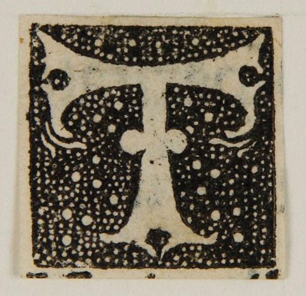
Editor: Here we have the "Letter T," by an anonymous artist. I'm immediately drawn to the contrast between the solid letterform and the stippled background. What compositional elements stand out to you? Curator: The interplay between positive and negative space is particularly striking. Note how the density of the stippling affects our perception of depth and texture. What theoretical frameworks could inform our understanding of this visual dynamic? Editor: Semiotics, maybe? The letter 'T' is both a sign and a shape. Curator: Precisely. The signifier and the signified. The form and the function. Perhaps structuralism could provide insight into the relationship between the letter and its surrounding elements. Editor: That's fascinating. I hadn't considered approaching it that way. Curator: Indeed. It is through such close visual analysis that we may begin to unlock the deeper structural truths contained within.
Comments
No comments
Be the first to comment and join the conversation on the ultimate creative platform.
More like this