#
comic strip sketch
#
quirky sketch
#
sketch book
#
traditional media
#
personal sketchbook
#
sketchwork
#
sketchbook drawing
#
storyboard and sketchbook work
#
cartoon carciture
#
sketchbook art
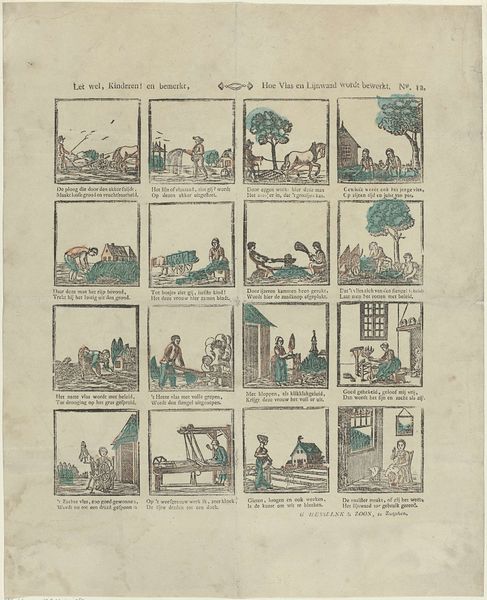
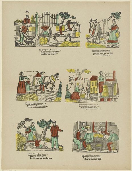
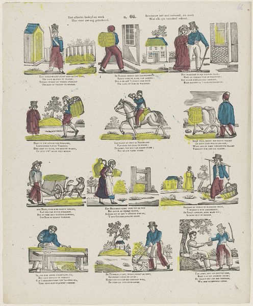
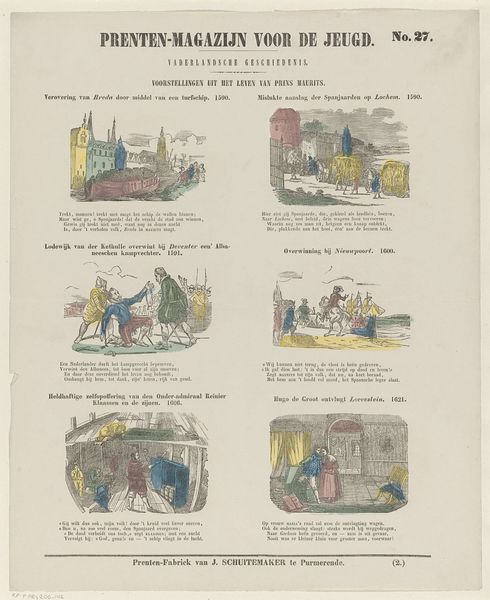
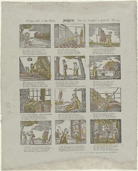
Dimensions: height 416 mm, width 340 mm
Copyright: Rijks Museum: Open Domain
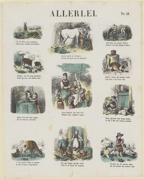
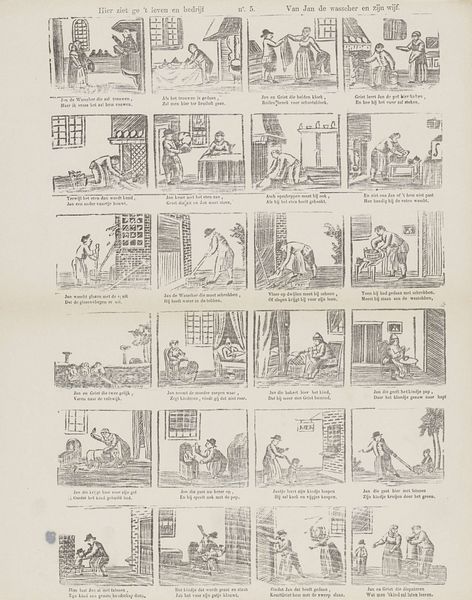
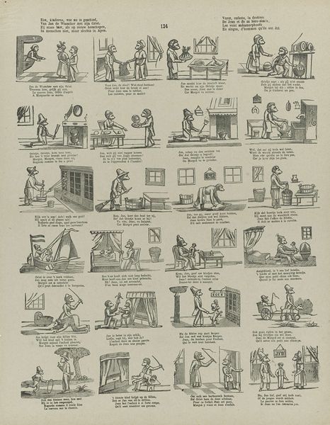
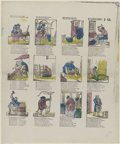
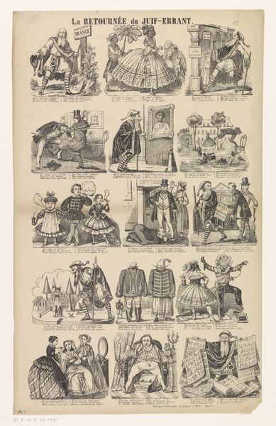
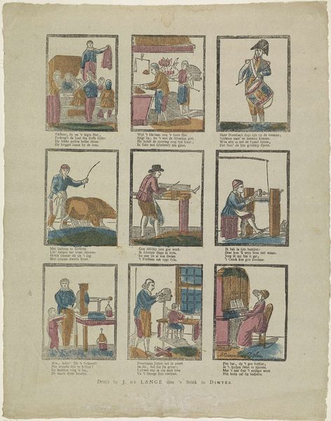
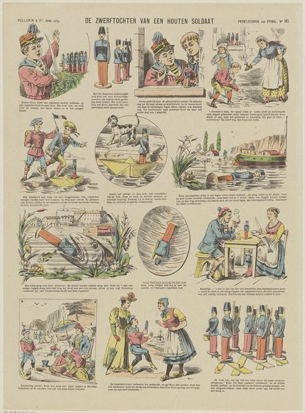
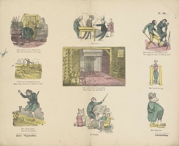
Editor: This piece is titled "Verschillende Taferelen," created in 1873, by De Ruyter & Meijer. It appears to be a page from a sketchbook, filled with a series of small, whimsical scenes. The overall effect is quite charming. What do you see in this work from a formal perspective? Curator: The interest here, first and foremost, resides in its composition. Note the deliberate arrangement of vignettes on the page. How does the structure influence your reading of individual scenes? Editor: Well, I hadn't thought about that initially. Now that you mention it, there’s a grid-like structure. Each scene is compartmentalized, almost like a comic strip without clear narrative connections, despite being placed alongside each other. Curator: Precisely. Observe how the limited color palette—the subdued blues, browns, and greens—unifies the diverse subject matter. Does the consistent application of color facilitate a sense of coherence across the entire work? Editor: I think it does. It prevents the eye from being overwhelmed and allows each scene to breathe despite the page being so full. Curator: Indeed. Consider also the application of line. Notice how the artist employs a consistent linework across the vignettes. Does this linear precision impact the texture and form depicted in the artwork? Editor: Absolutely. The thin lines create a sense of detail without adding bulk and the forms almost feel sketched out quickly. They contribute to a lighter, almost ephemeral, feeling. Curator: So, we have the page layout and colour, the interplay of form and function that suggests a particular artistic purpose, an almost pedagogical approach even in its levity. This exercise has highlighted the necessity of examining beyond the initial impression. Editor: I agree. Looking at the structural choices of colour and the repetition in the linear elements provides greater nuance to this sketchbook piece. Thanks for the insight!
Comments
No comments
Be the first to comment and join the conversation on the ultimate creative platform.
More like this