mixed-media, watercolor
#
mixed-media
#
contemporary
#
water colours
#
watercolor
#
geometric
#
ceramic
#
abstraction
Copyright: Jennifer Bartlett,Fair Use
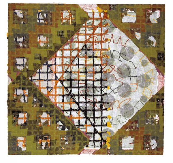
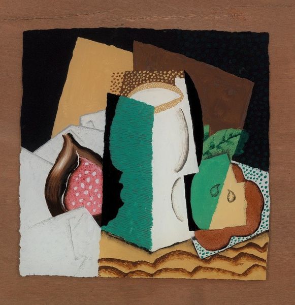
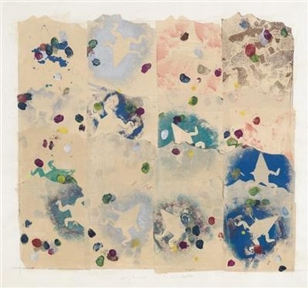
Editor: So, here we have Jennifer Bartlett's "Homan-Ji III" from 1995, a mixed-media work incorporating watercolor. It feels almost like a meticulously arranged tabletop still life, but with a geometric abstraction woven in. How do you interpret this work, looking at its visual elements? Curator: Primarily, I am drawn to the interplay between the representational and the abstract elements. Note how the precise rendering of the seashells, each possessing a distinct texture and tonal variation, contrasts with the stark, planar geometry of the superimposed square and diamond. These shapes, devoid of representational content, operate as formal devices, disrupting the illusionistic space suggested by the shells. Editor: The shells feel so light and airy against those dark, solid shapes. What effect do you think she was trying to create with this? Curator: Precisely. The grid-like structure underlying the composition—barely visible but palpably present—serves to further emphasize this contrast. It's a spatial framework against which the organic forms of the shells and the rigid geometry interact. Are we meant to interpret this as a tension? Or is it meant to feel as if all parts are simply compositional? The darker square sits so deliberately on the light airy canvas. I would love to know Bartlett’s intent. Editor: I see it! So the shells, grid, and geometric shapes are almost in conversation with each other. Curator: Precisely! Consider the use of color. The muted, earthen tones of the shells and the grounding of the background foil to further emphasise shape and tonal control through contrast with the geometric squares, the lighter against the shell’s background tonality and the other so dark as to flatten the canvas. Editor: I’m now looking at the materials as a way to understand her process. Curator: This deliberate engagement with varied materialities contributes to the complexity of the work. Watercolor, ceramic even... It all feels deliberately chosen to highlight each form and plane. It encourages the viewer to engage with the visual language of shape, form, and texture. Editor: It’s almost like a formal study of contrasts in artistic elements. Thanks, that was very insightful! Curator: A pleasure. Considering the structure is primary when thinking about the feeling this image elicits, that the medium lends to each component is fundamental to seeing the sum.
Comments
No comments
Be the first to comment and join the conversation on the ultimate creative platform.
More like this