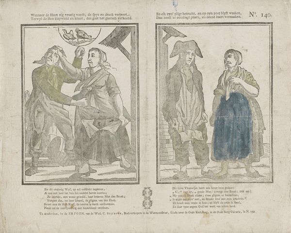
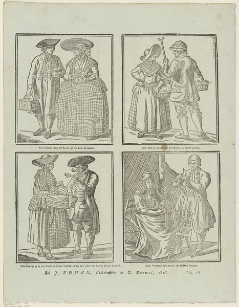
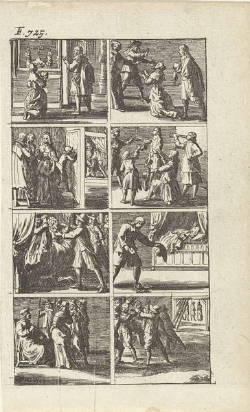
Wanneer de haan zig vraatig voedt; de spys en drank verteert, / Terwyl de hen klapwiekt en kraait, dan gaat het gantsch verkeerd. / Zo elk zyn' pligt betracht, en op zyn post blyft waaken, / Dan heeft 'er eendragt plaats, en deeze baart vermaaken 1806 - 1830
0:00
0:00
gerritoortman
Rijksmuseum
print, engraving
#
narrative-art
# print
#
old engraving style
#
folk-art
#
comic
#
genre-painting
#
history-painting
#
engraving
Dimensions: height 317 mm, width 408 mm
Copyright: Rijks Museum: Open Domain
Curator: We're looking at an engraving here. The work is titled, *Wanneer de haan zig vraatig voedt; de spys en drank verteert, / Terwyl de hen klapwiekt en kraait, dan gaat het gantsch verkeerd. / Zo elk zyn' pligt betracht, en op zyn post blyft waaken, / Dan heeft 'er eendragt plaats, en deeze baart vermaaken,* made by Gerrit Oortman, sometime between 1806 and 1830. The piece feels somewhat… didactic. What are your first thoughts? Editor: The composition is divided into two distinct scenes. The contrast in their tone is rather striking, isn't it? What draws your eye and informs your reading of this work? Curator: Note the stark lines and minimal shading; the composition emphasizes distinct shapes and forms. The artist has employed a somewhat rigid formalism. There is an immediate visual tension between the crowded chaos of the scene on the left versus the ordered sobriety on the right. How does that visual dynamic speak to you? Editor: I suppose the engraving technique lends itself to that contrast— the stark lines emphasize order, or the lack thereof. The almost comic quality also informs the overall feeling. Do you think the lack of color impacts how we perceive its message? Curator: Absence of color certainly focuses our attention on line and form. The rigidity is not merely technical; it reflects a moral order. The scenes, almost diagrammatic, point to the consequences of disrupting a perceived natural order. The artist creates meaning through binary oppositions—chaos and order, excess and sobriety, deviance and duty. Note also that the figures in the first panel seem to crowd the limited space within the picture frame. This effect gives it an oppressive feel. Editor: Seeing it as a structured argument laid out through contrasting scenes, really clarifies its purpose. I hadn't fully appreciated the formal composition before you pointed that out. Curator: Precisely. The aesthetic qualities reinforce and communicate moral values—or rather, dictate acceptable moral structures in life, even through folk-art. A clear connection between form and function, wouldn't you agree?
Comments
No comments
Be the first to comment and join the conversation on the ultimate creative platform.
More like this