graphic-art, mixed-media, collage, print, poster
#
graphic-art
#
aged paper
#
mixed-media
#
collage
#
hand-lettering
# print
#
hand drawn type
#
hand lettering
#
personal sketchbook
#
hand-drawn typeface
#
fading type
#
sketchbook drawing
#
poster
#
sketchbook art
#
marker colouring
Copyright: Rijks Museum: Open Domain
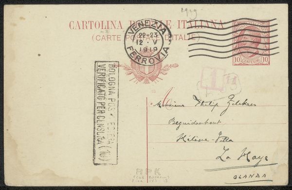
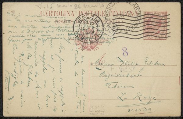
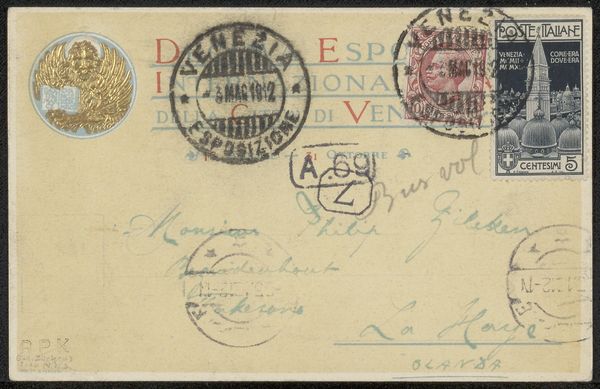
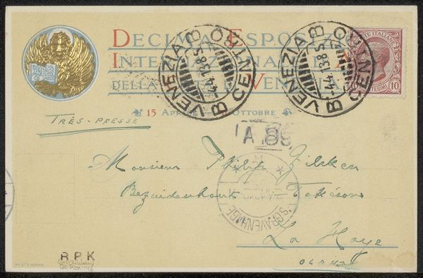
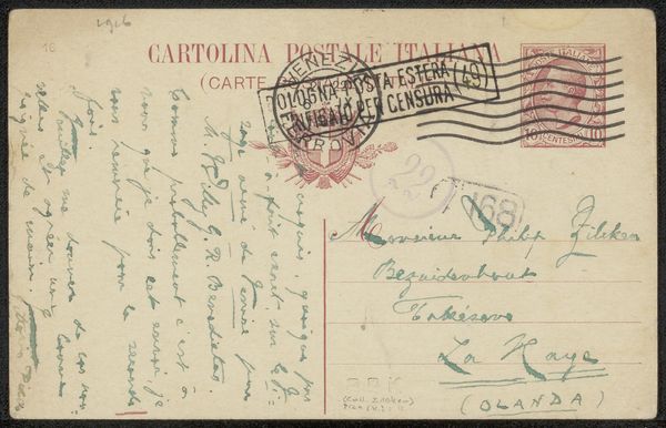
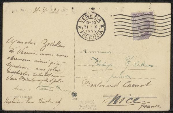
Curator: Here we have a piece titled "Briefkaart aan Philip Zilcken," a mixed media work potentially dating between 1916 and 1929. It combines collage elements with printmaking and hand lettering on what appears to be aged paper. Editor: It has such a worn, immediate quality. Looking at all those postal markings – the stamps, the censor’s marks – you can almost feel the weight of that era. A rather melancholy piece, don’t you think? Curator: It is suggestive of the wartime censorship, absolutely. These postal markings indicate this card travelled during a period of intense geopolitical scrutiny. It speaks volumes about information control and anxieties of the time. Editor: The various stamps and seals become a visual language. Each one—from the official Italian postage to the superimposed "Censura Posta Estera Militare"—tells a story of surveillance and restriction. This layering evokes a deep sense of suppressed communication. The overall design even feels quite heraldic, wouldn’t you say? All those seals echo images of eagles and coats of arms. Curator: A good observation! There’s definitely a connection to established visual codes. But I'm particularly intrigued by the 'Esposizione Internazionale d'Arte della Città di Venezia', suggesting an international art exhibition amid the turmoil, maybe to emphasize Venice’s relevance. Editor: The placement is really important. See how the circular postmark cuts right across "Internazionale"? That jarring disruption perfectly captures the tension between the aspiration of global exchange and the harsh realities of national borders and wartime limitations. Even the fading type adds a poignant element of loss. Curator: This interplay reflects the complexities within the artistic and intellectual communities. And a fascinating intersection of public declaration and private exchange that this piece facilitates for a retrospective reading, doesn’t it? Editor: Absolutely. It makes one consider all the hidden messages that artworks and everyday communication, intentionally or not, always bear within them. A touching time capsule. Curator: Indeed. This “Briefkaart” serves as a powerful reminder of the profound intersection between art, history, and personal experience. Editor: And a quiet reflection on how messages transcend—or are confined by—the boundaries of both time and politics.
Comments
No comments
Be the first to comment and join the conversation on the ultimate creative platform.
More like this