graphic-art, print
#
deckled
#
colouring book
#
graphic-art
#
magazine cover layout
#
aged paper
#
art-nouveau
#
medieval
#
page thumbnail
# print
#
book
#
tea stained
#
text
#
russian-avant-garde
#
golden font
#
word imagery
#
historical font
#
columned text
Copyright: Public domain
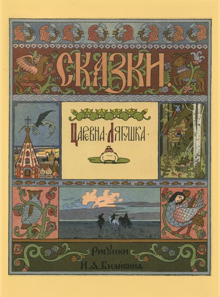
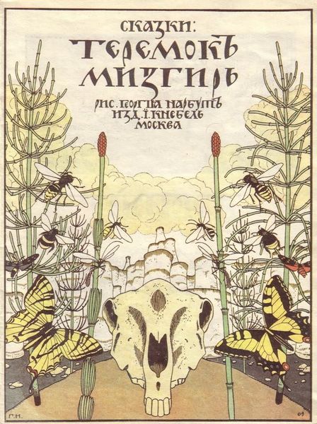
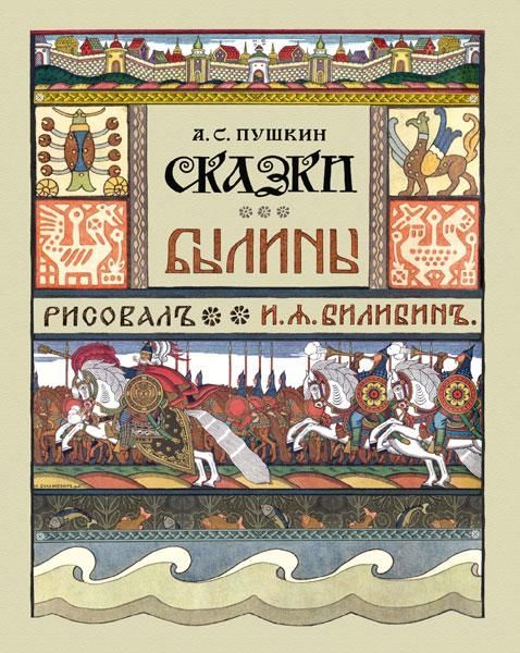
Editor: This is the cover for the collection of Russian Folk Tales by Ivan Bilibin, created in 1900. It has such an intricate design that I found the visual organisation on this cover particularly striking. How do you interpret its complex layout and ornamentation? Curator: The Bilibin cover demonstrates a sophisticated manipulation of the picture plane. Note how the design compartmentalizes various narrative vignettes within a rigid, almost geometric framework. The composition is remarkably balanced, both horizontally and vertically. The application of colour, while seemingly decorative, also serves a structural purpose, delineating spaces and guiding the viewer’s eye through the complex iconographic schema. Do you observe how the palette is constrained to a set of harmonious tertiary tones, unified across all illustrated segments? Editor: Yes, I see that now! The limited colour palette gives a sense of cohesion. It really underscores the geometry of the composition and contributes to the piece’s visual harmony. Curator: Indeed. And consider the linework: precise, almost calligraphic in quality. It emphasizes contour and detail, contributing to a graphic clarity, reminiscent of medieval manuscript illumination. In addition, notice the relationship between the positive and negative space and their relation in terms of compositional balance. Editor: The black lines in the lettering and drawings give definition and depth to the forms. I am especially captivated by the ornamental details like the mythical animals and swirling foliate patterns surrounding the title. What’s their role here? Curator: These embellishments serve not merely as decoration but as structural components that articulate and enliven the space surrounding the central text. They offer another layer to the design; how do you see it working to support a central message? Editor: I now realize Bilibin’s skillful blend of graphic clarity and intricate details really enhance both the cover's aesthetic appeal and readability. I understand more about how his technique reinforces and carries his cultural expression. Curator: Exactly! It’s through such careful attention to form, line, and colour that Bilibin achieves a powerful and unique visual statement. The work speaks to an intentional construction of pictorial space, showcasing a mastery of graphic design elements to create a compelling piece of art.
Comments
No comments
Be the first to comment and join the conversation on the ultimate creative platform.
More like this