#
abstract expressionism
#
popart
#
abstract painting
#
graffiti art
#
pop art
#
handmade artwork painting
#
fluid art
#
naive art
#
paint stroke
#
chaotic composition
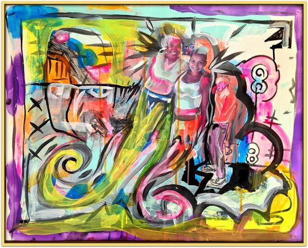
Dimensions: 56 x 71 cm
Copyright: David Michael Hinnebusch,Fair Use
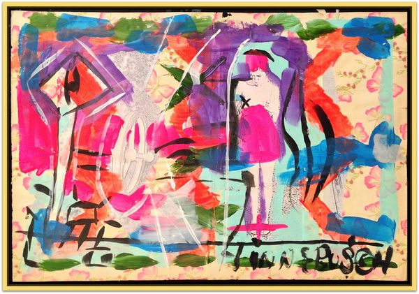
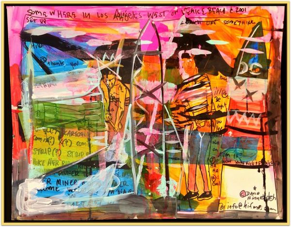
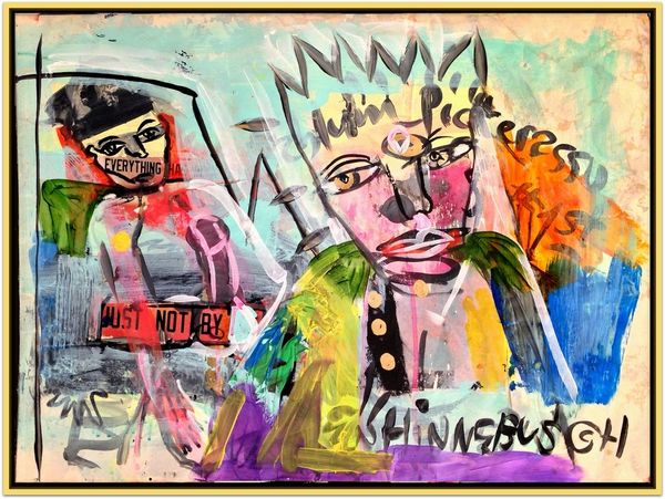
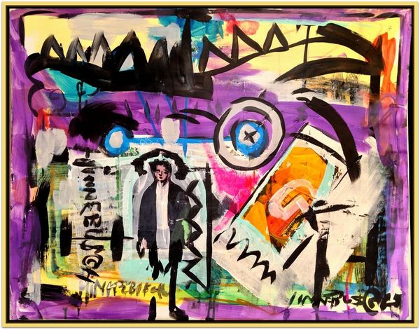
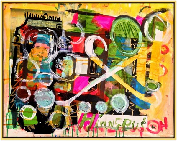
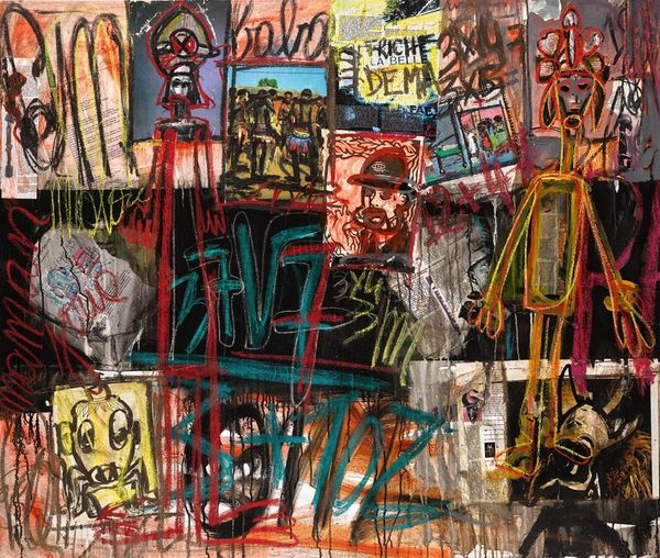
Curator: David Michael Hinnebusch created "Butter" in 2017. It’s quite a vibrant mixed-media work. What are your immediate thoughts? Editor: Sensory overload, but in a compelling way. It's riotous. I'm trying to find a grounding point in this visual chaos. Curator: Perhaps that handwritten text at the top might serve as a focal point? The way “THIS IS BETTER TO DEAL WITH KNOWN” dominates the upper register? I find the crude lettering quite effective. Editor: It does have a primitive, declarative quality that arrests the eye, doesn't it? The artist may be suggesting the dangers outside familiar spaces. Look at how "KNOWN" is repeated in a chaotic fashion that reminds me of cave paintings. Is the image of the man crouched over, using something to paint, a depiction of the artist himself, and the idea of the hand? Curator: Certainly, it acts as an important icon. Observe the interplay of bold blacks and bursts of yellows and blues around that lower corner figure, for instance. There is the figure itself with a clearly distinguished, even stylized pose, juxtaposed with near abstract areas of vibrant colour and freehand graffiti. There is a dialogue established between different planes of artistic awareness here, I would argue. Editor: Layering memories onto surfaces that give hints, a narrative where you are aware there is a personal meaning that exists but we can only decipher so much of it through these symbolic images. There's a deliberate lack of refinement, making it raw and honest. But why 'Butter'? Curator: An interesting question and I confess I am not immediately sure how to read into that title. Perhaps "butter" to suggest how easily messages or stories spread, or perhaps because the materiality of thick buttery applications of paint and media appealed to the artist? I am really just offering ways we could try and frame this puzzle. Editor: Regardless of the exact meaning of its title or of its symbology, this piece compels viewers to confront their own emotional and psychological connections. The artwork uses a familiar format to force you out of your own familiar sphere of meaning. Curator: I think I must agree with that sentiment, for the artist successfully creates a stimulating visual experience, irrespective of any concrete interpretation.
Comments
No comments
Be the first to comment and join the conversation on the ultimate creative platform.
More like this